
- BoostSolutions
-
Products
-
- Microsoft Teams
- HumanLike Alert Reminder
- View All Apps
- Pricing
- Support
- Company
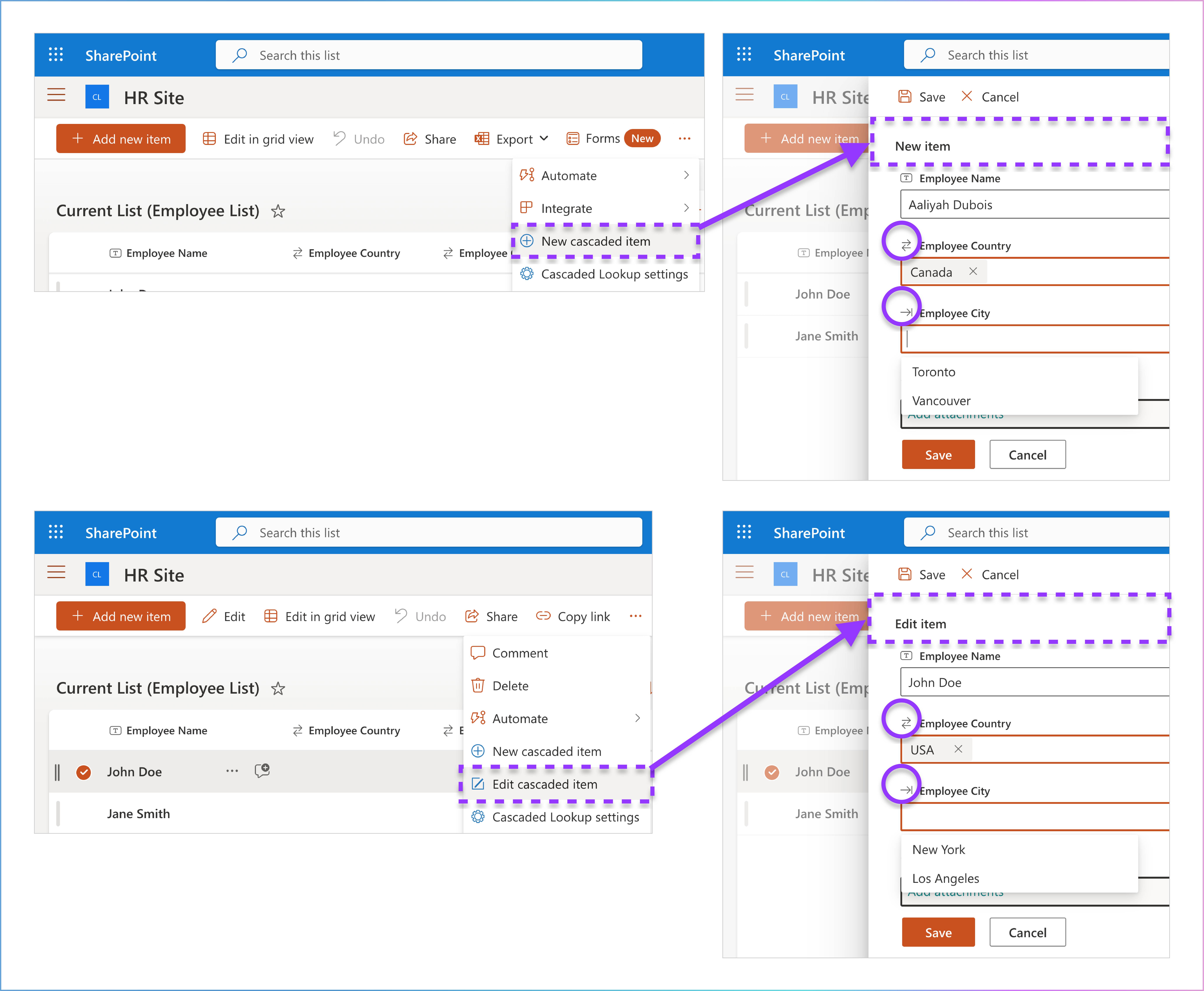
Once you've added the Cascaded Lookup App to your SharePoint Online site, you'll notice three new commands added to the list command bar at the top of the page when you open a list. These commands are designed to help you manage and customize cascaded lookup columns in your SharePoint list, making it easier to work with hierarchical or dependent data.
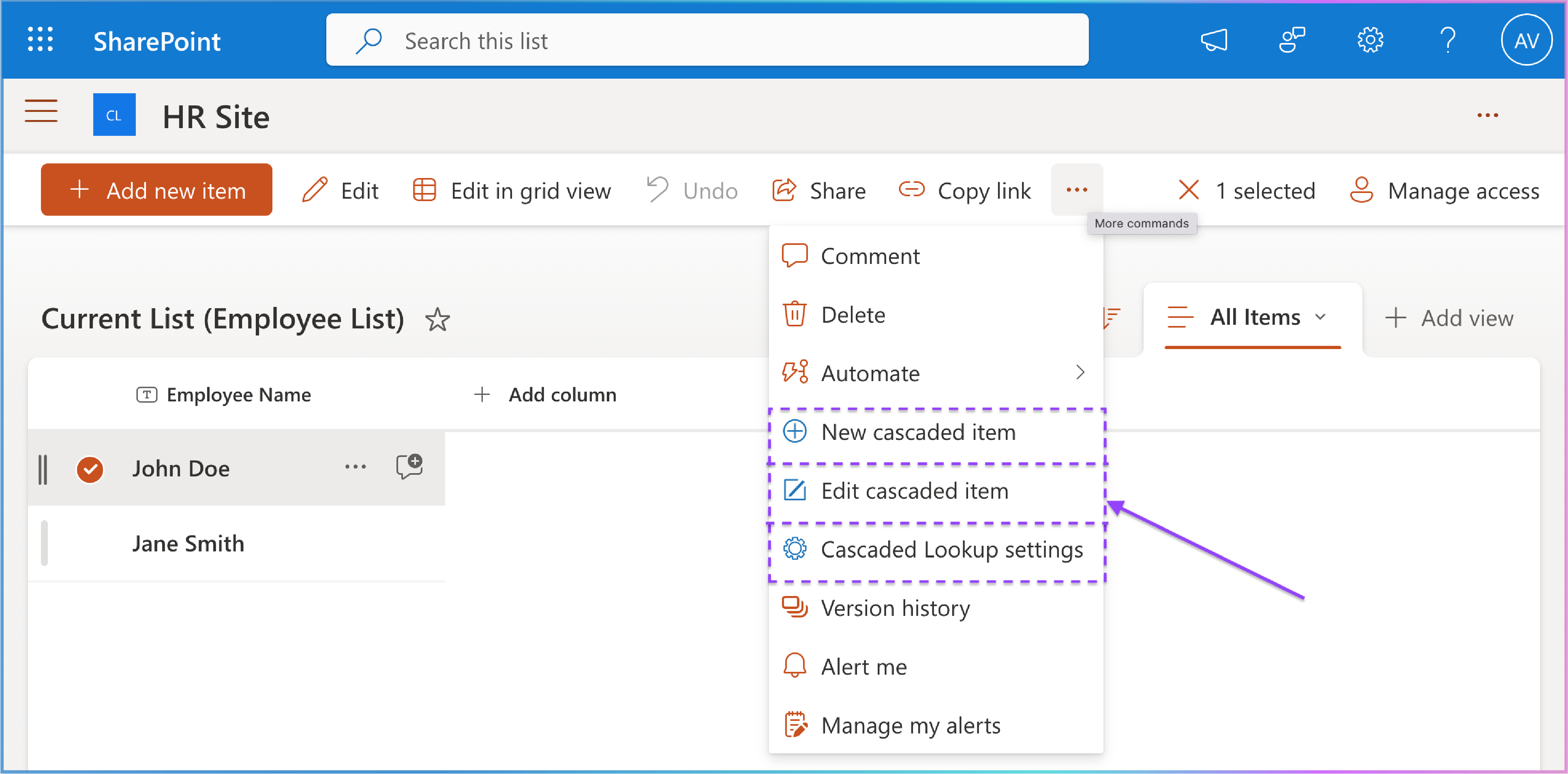

This command allows you to create a new item in your list with cascaded lookup columns. It simplifies the process of adding items that rely on dependent dropdowns (e.g., selecting a city based on a chosen country).
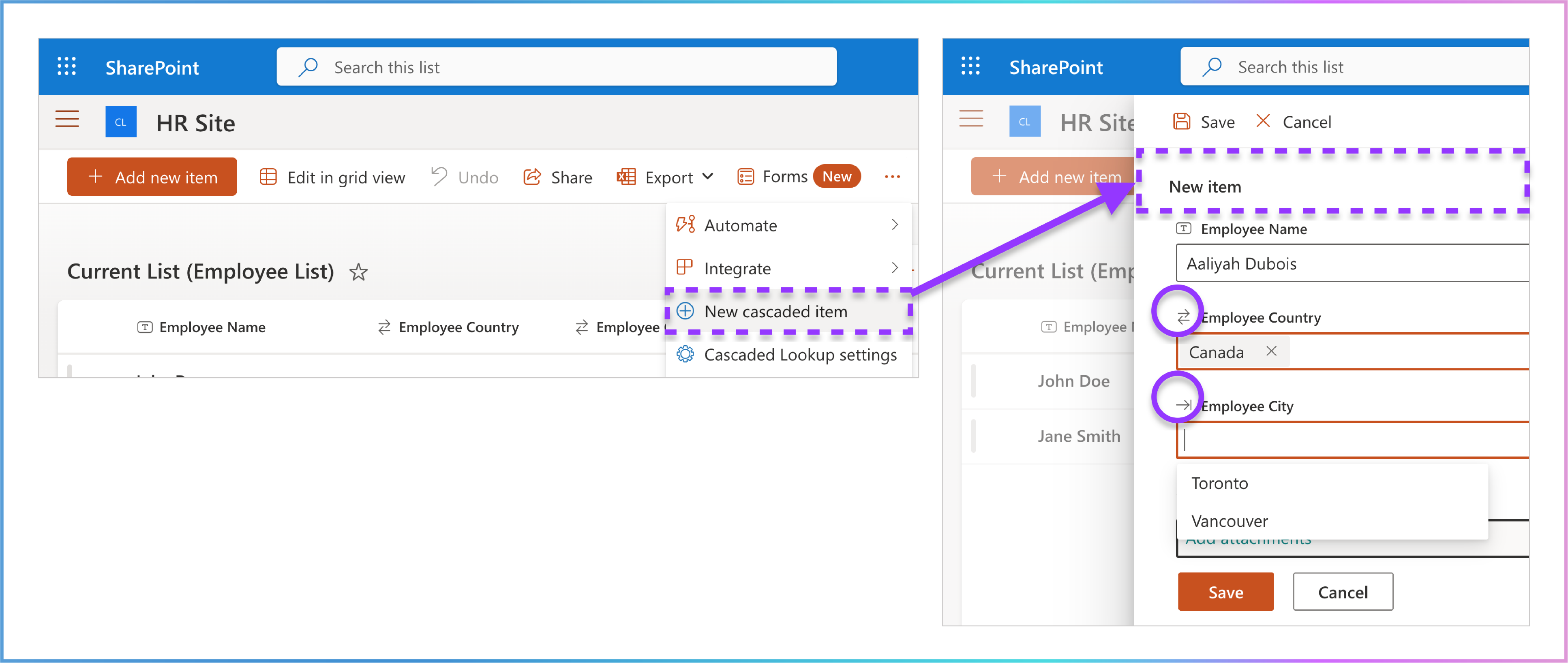

This command allows you to edit existing items that include cascaded lookup columns .
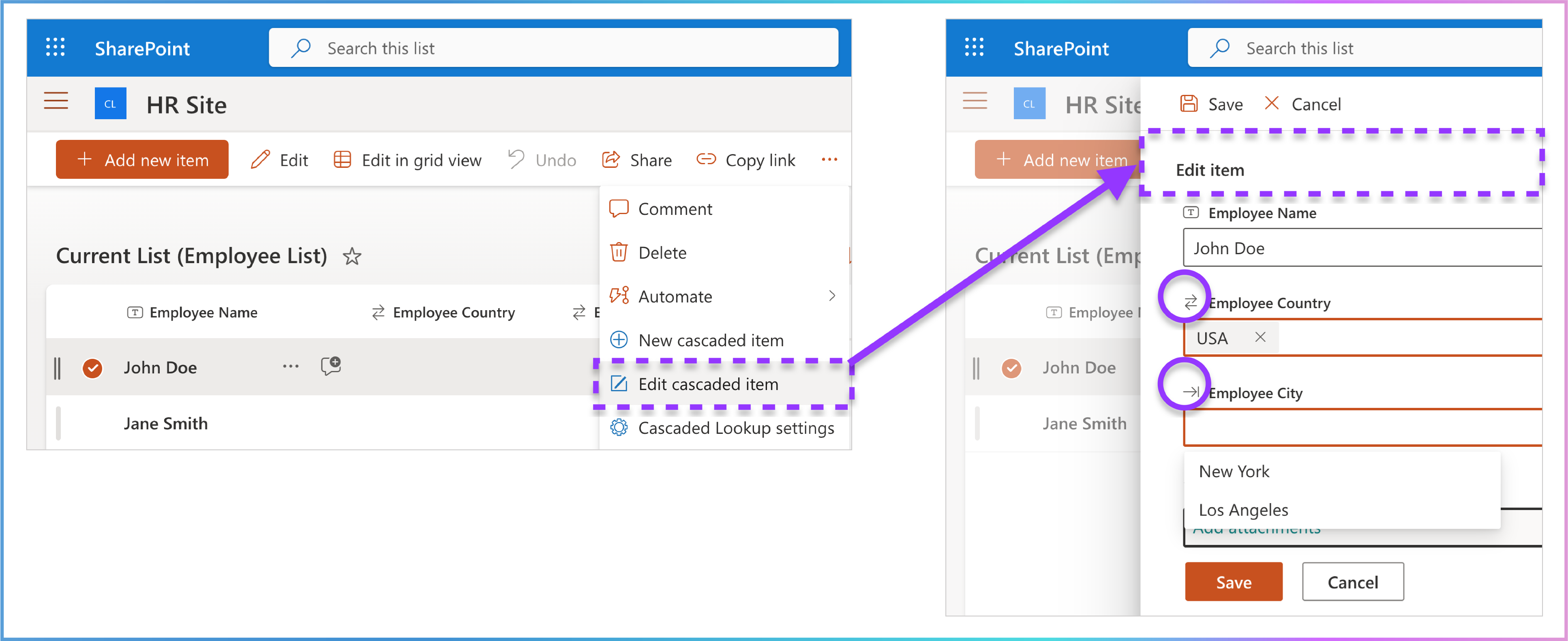

This command opens the Cascaded Lookup Settings panel, where you can configure and manage cascading relationships between columns in your list. This is where you define how columns interact (e.g., filtering cities based on a selected country).
To locate the Cascaded Lookup App commands, follow these steps:

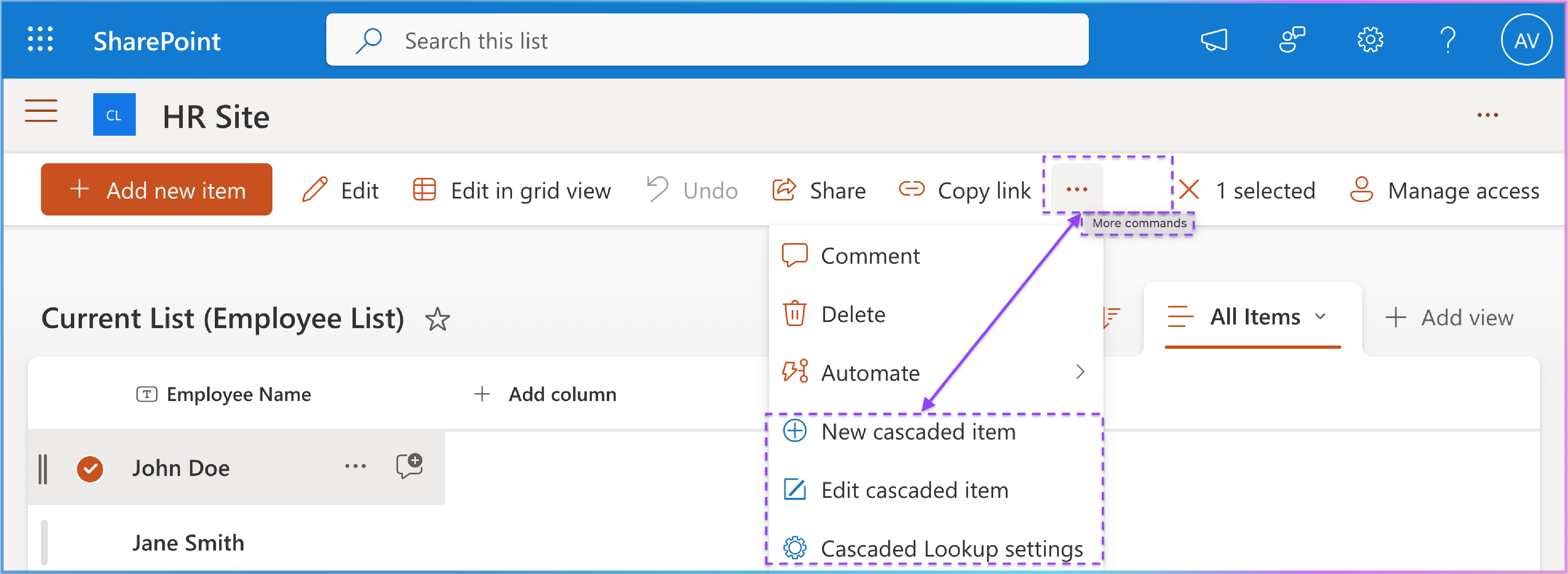
If you're unable to find the commands, try the following:
1. Verify Installation:
Double-check that the Cascaded Lookup App is properly installed and enabled on your site.
2. Check for Customizations:
Contact your SharePoint administrator to ensure there are no customizations or restrictions affecting the visibility of these commands.
Cascaded Lookup Settings Panel
The Cascaded Lookup Settings Panel is your central hub for managing your subscription, configuring, and managing all Cascaded Lookup columns and custom forms. To access it, open your SharePoint Online list and click on the Cascaded Lookup Settings command in the list command bar.
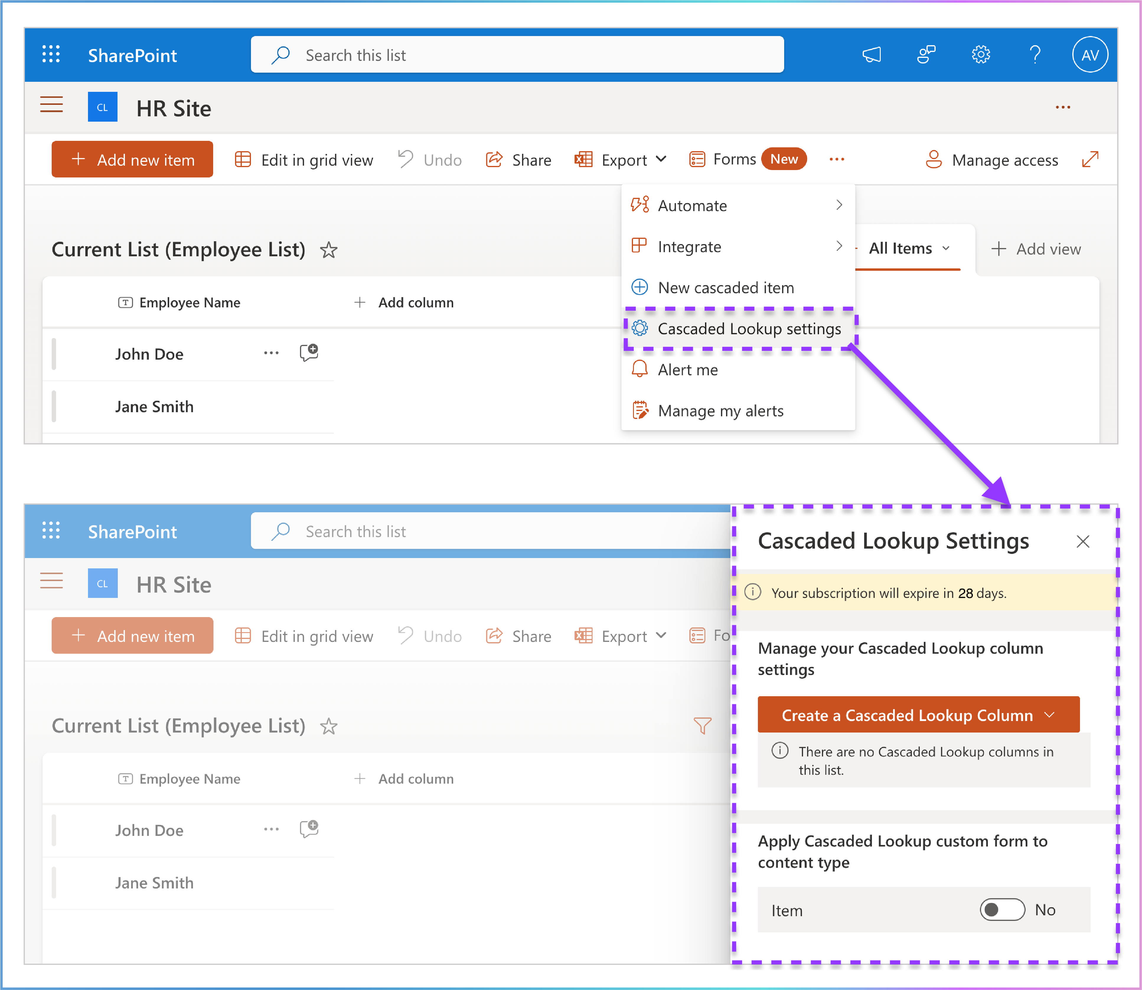
Panel Overview
The panel is divided into three key sections:
Subscription Status: Provides an overview of your app subscription.
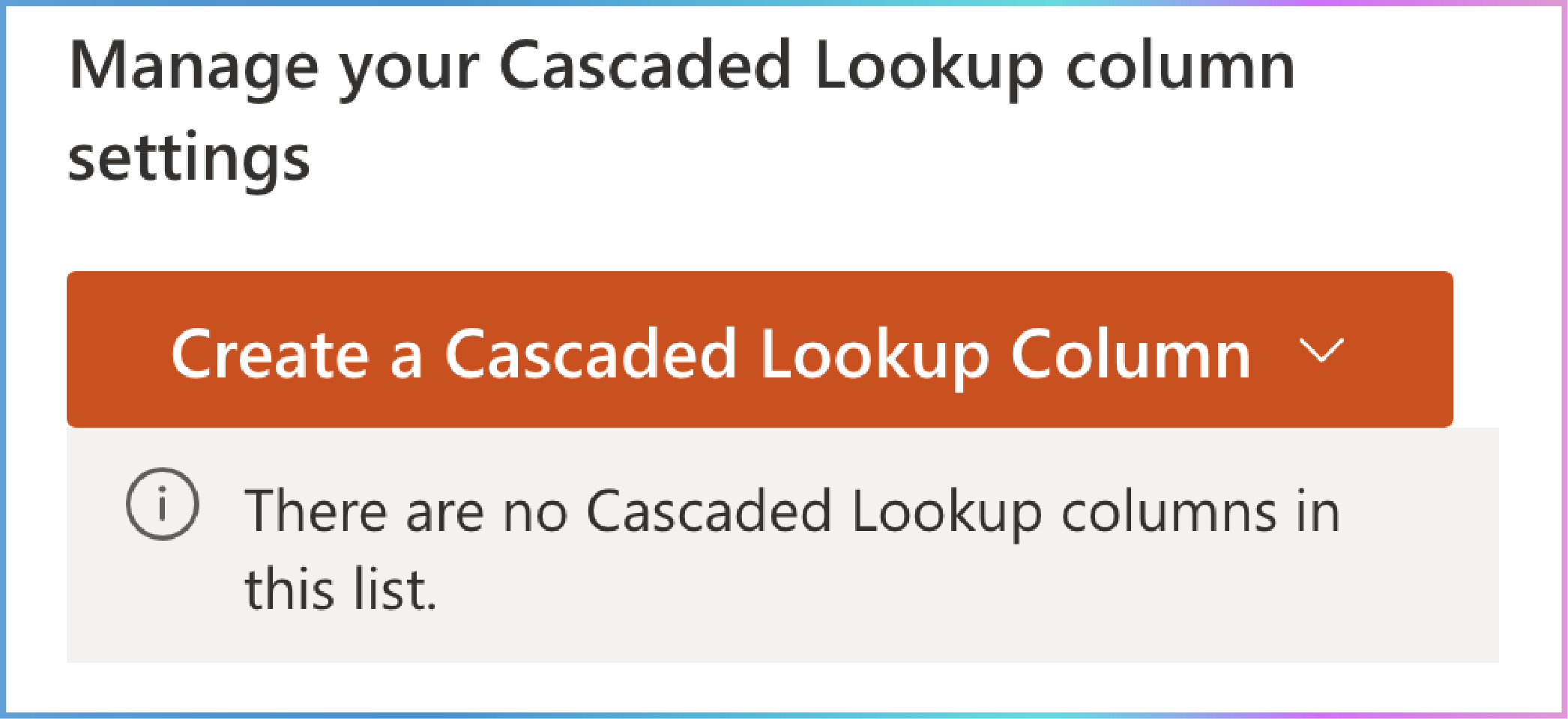
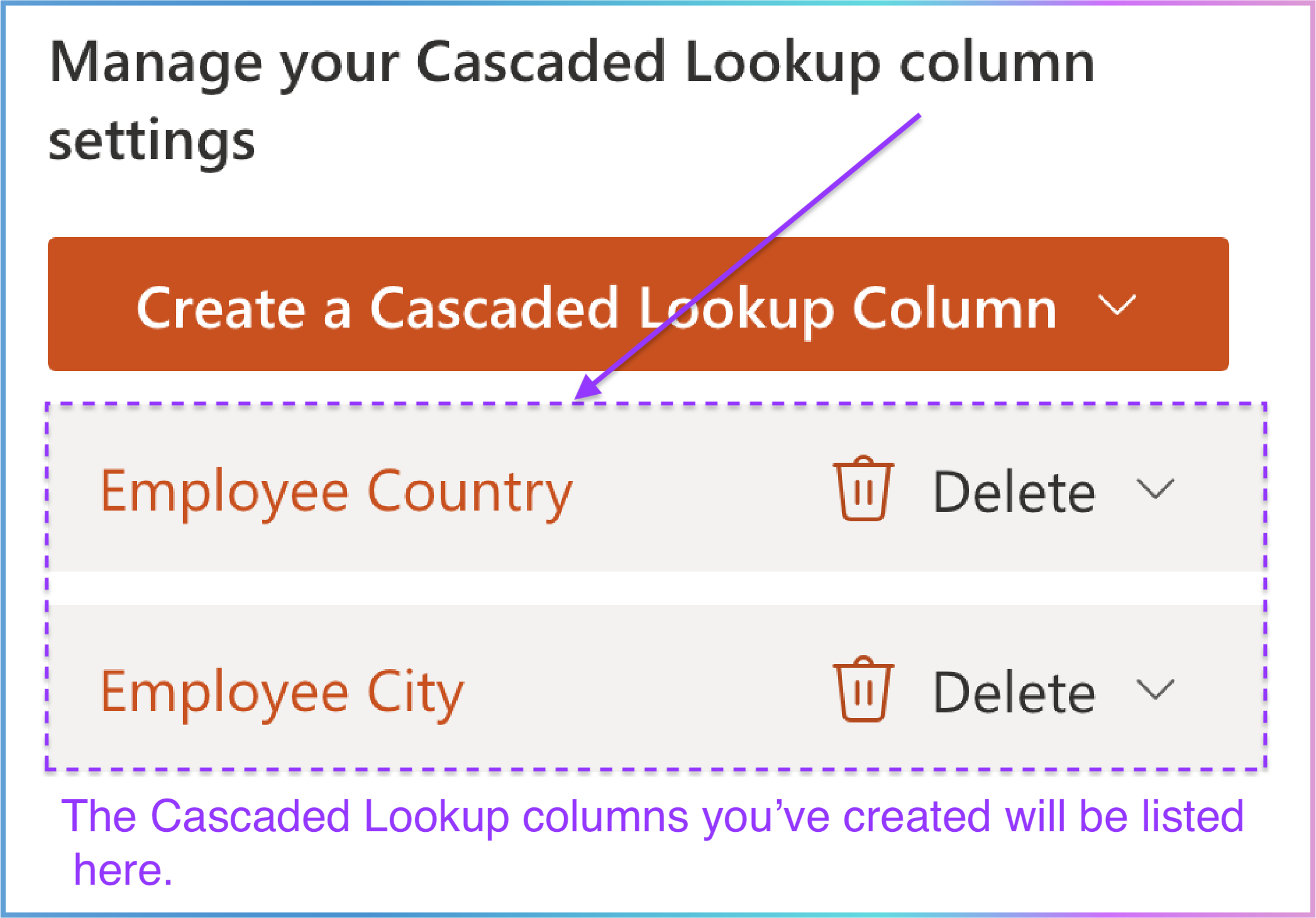
Manage Your Cascaded Lookup Column Settings: Allows you to create, edit, delete, or convert cascaded lookup columns.
Apply Cascaded Lookup Custom Form to Content Type : Controls how cascading functionality integrates with SharePoint’s standard forms.
Let’s explore each section in detail.
1. Subscription Status: Keeping You Informed

Located at the top of the panel, this section provides a quick overview of your Cascaded Lookup App subscription status. It’s a clickable message that offers more details about your subscription. Think of it as a health check for the app’s functionality.
2. Manage Your Cascaded Lookup Column Settings
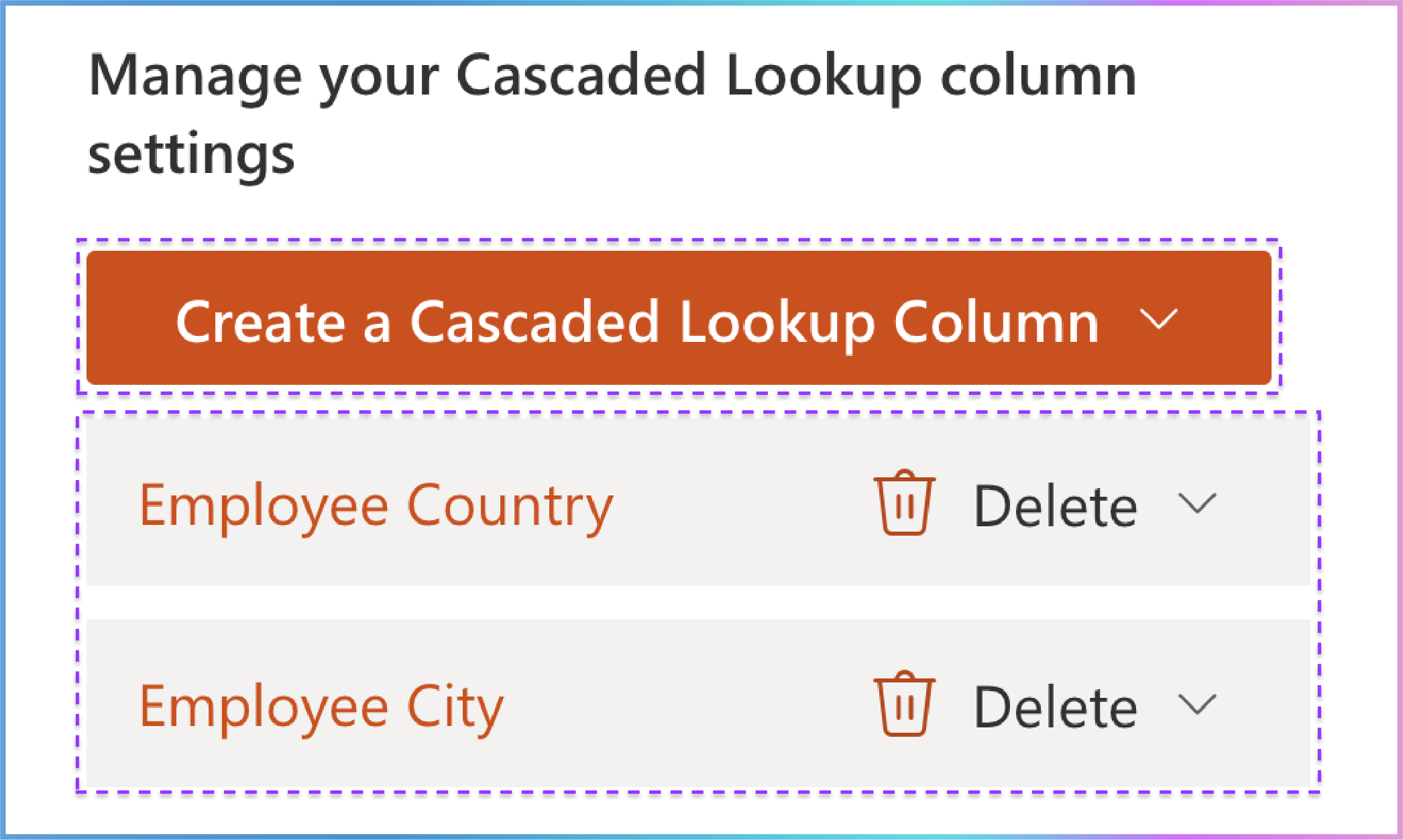
This section, located directly below Subscription Status , is where the core management of your cascaded lookup columns happens.
This section contains two parts:
Key Actions:
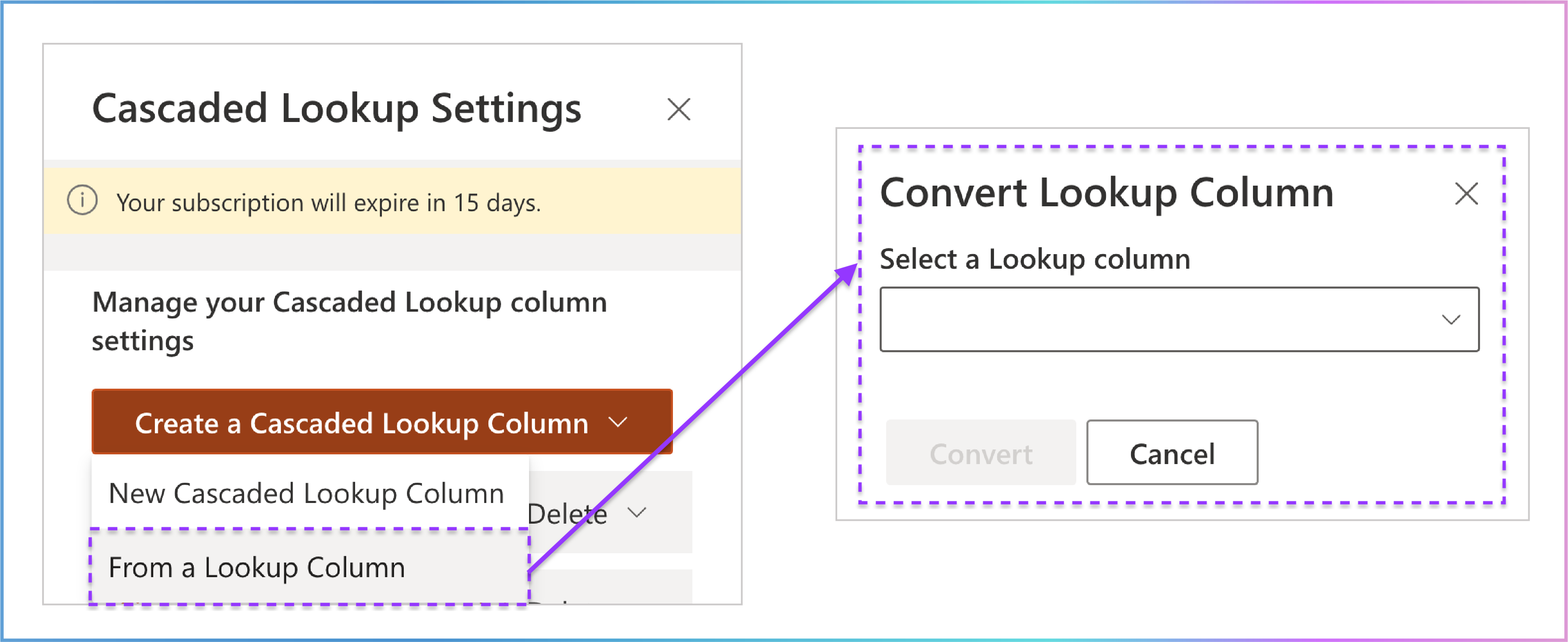
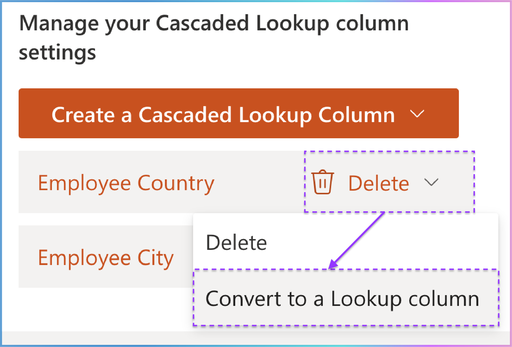
Convert Existing Columns: Transform a standard Lookup column into a Cascaded Lookup column , adding dynamic cascading behavior.
Edit Existing Columns: Modify the settings of your existing Cascaded Lookup columns.
Step-by-Step Instructions:
Creating a Cascaded Lookup Column:
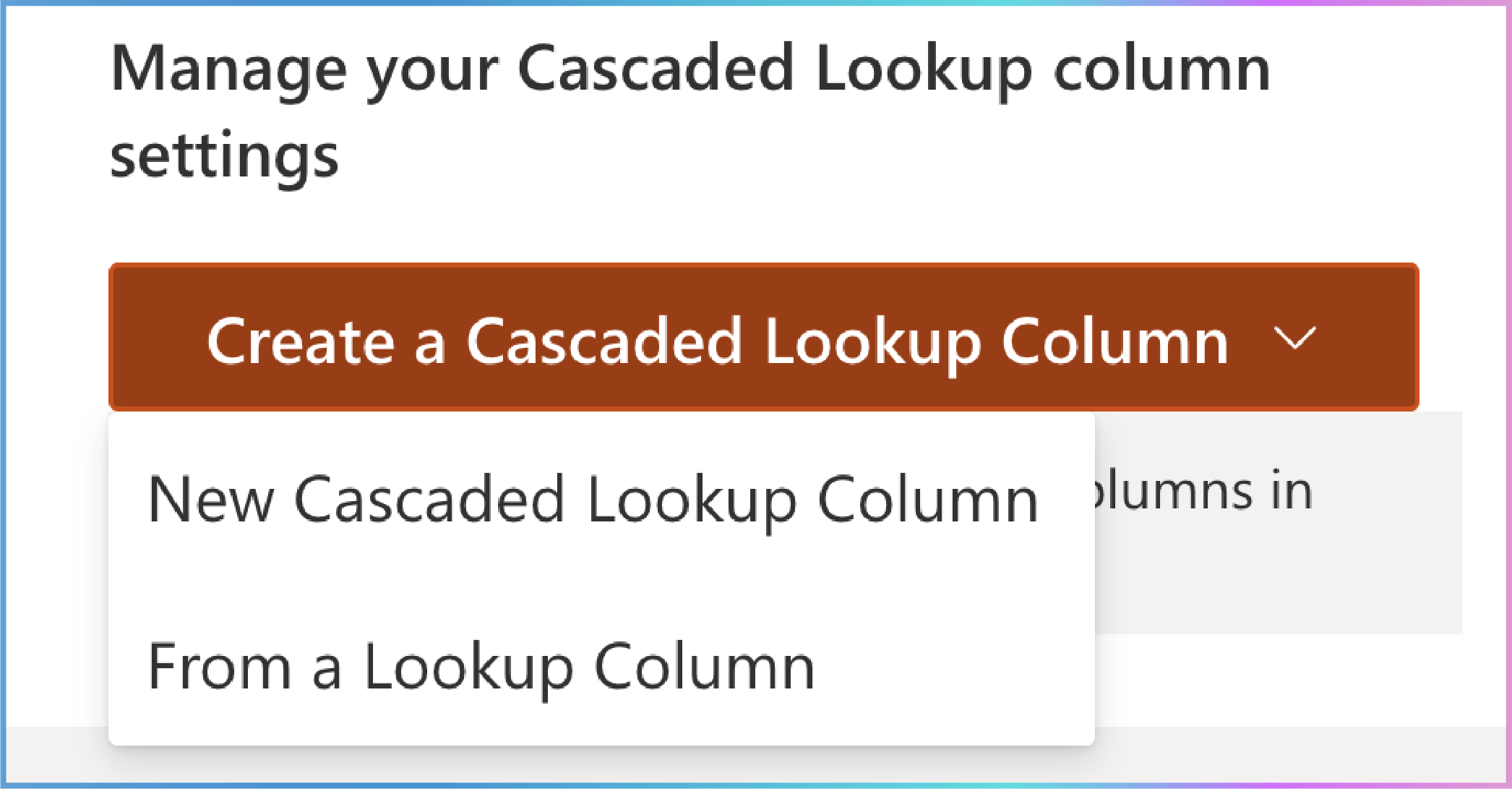
Choose one of the following options:
Editing a Cascaded Lookup Column:
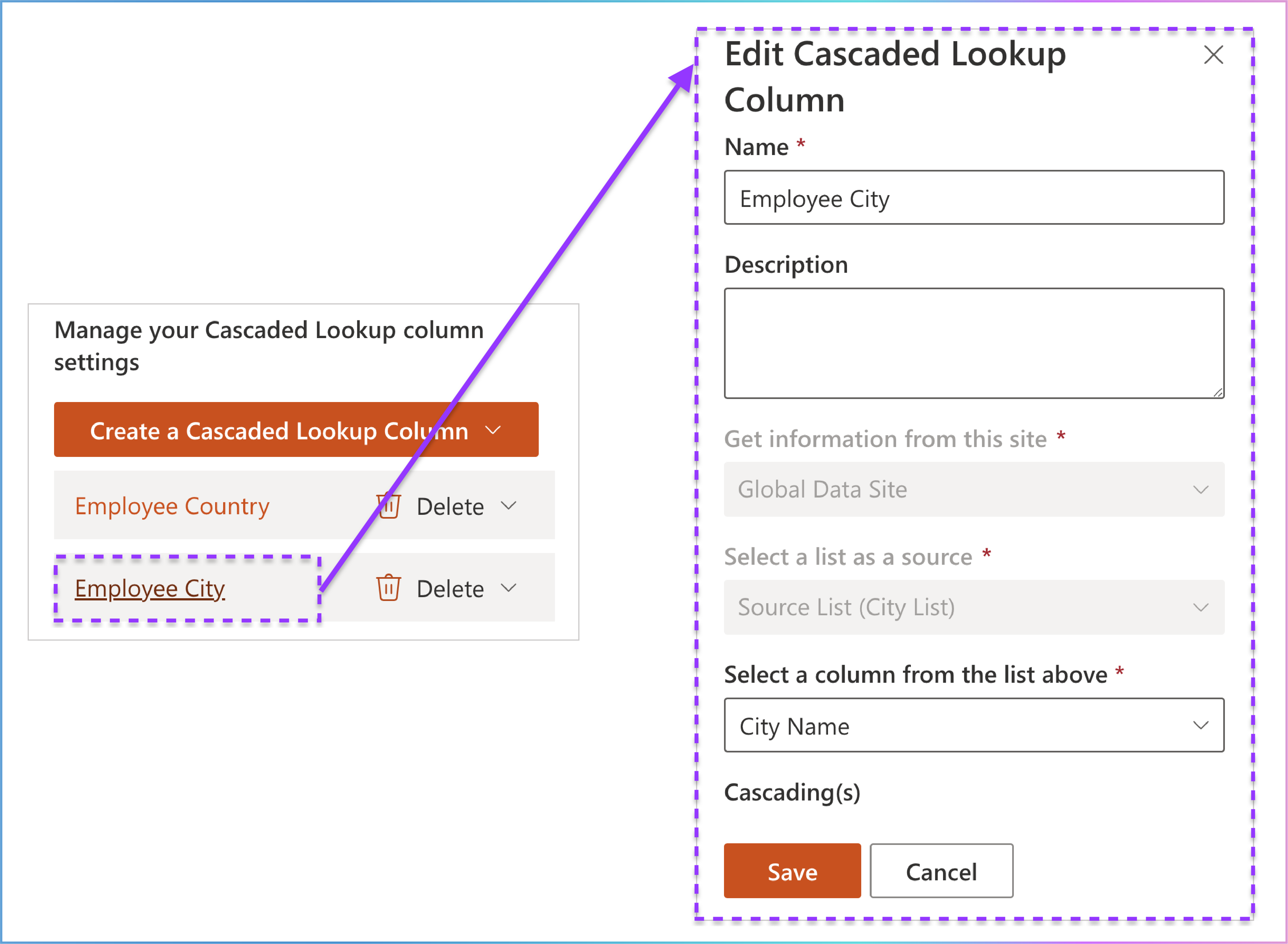
Please Note: Once a cascaded lookup column is successfully created, certain fields become non-editable for consistency and data integrity. These include:
"Get information from this site"
"Select a list as a source"
Deleting a Cascaded Lookup Column:
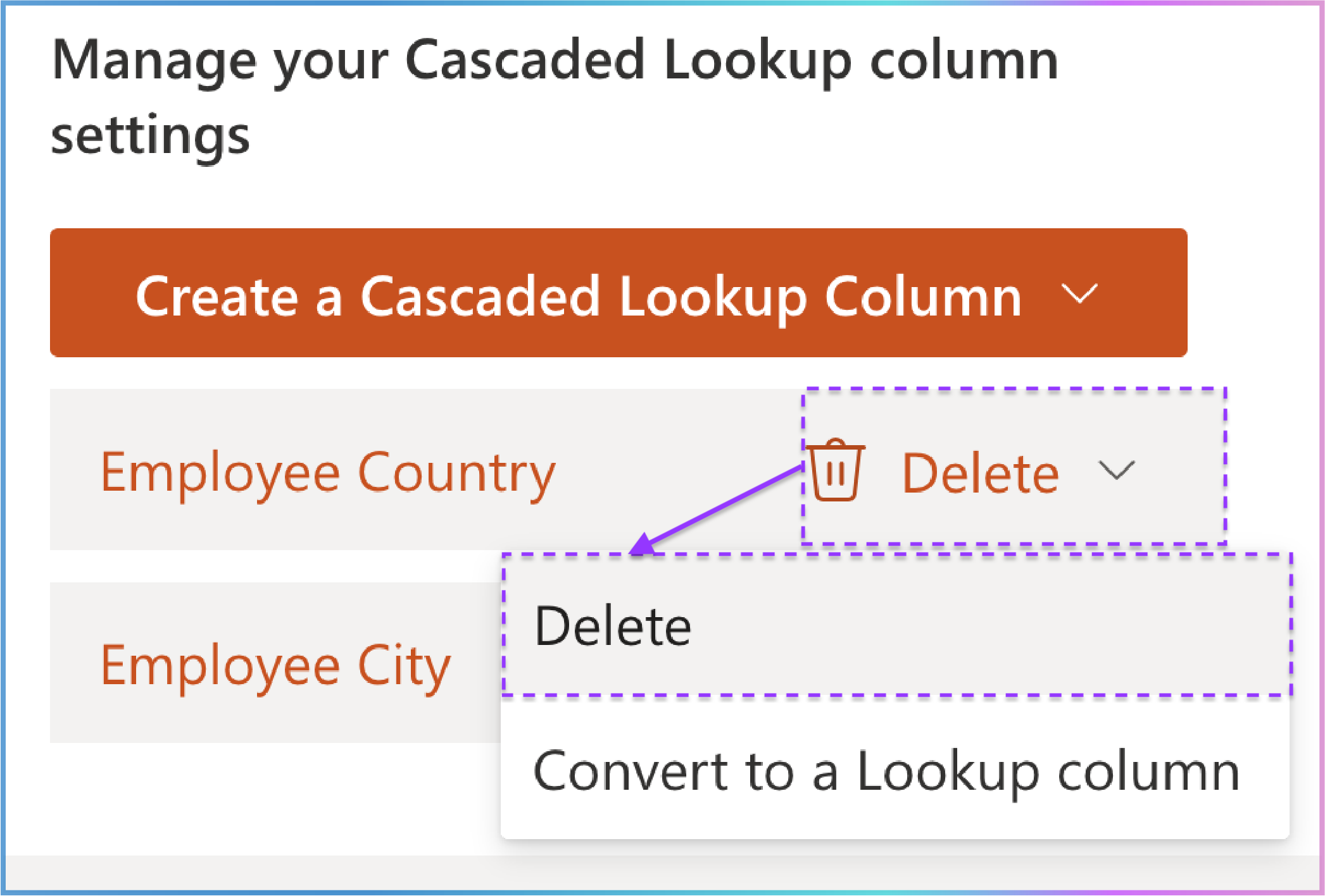
Select the Delete option.
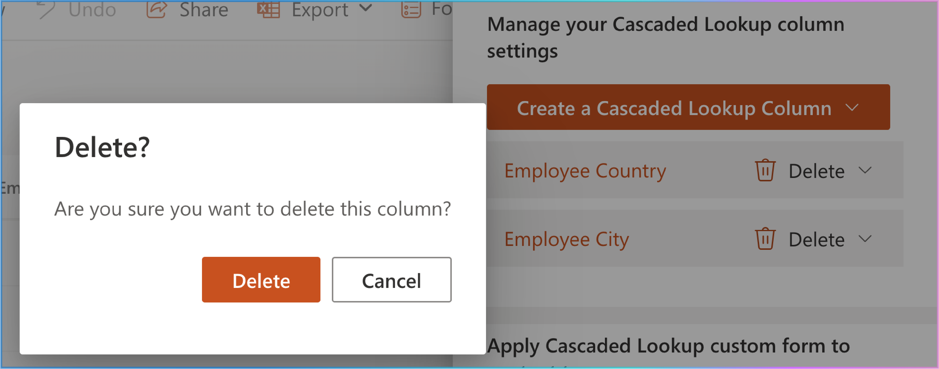
Click Delete to confirm.
Converting a Cascaded Lookup Column Back to a Standard Lookup Column:
3. Apply Cascaded Lookup Custom Form to Content Type
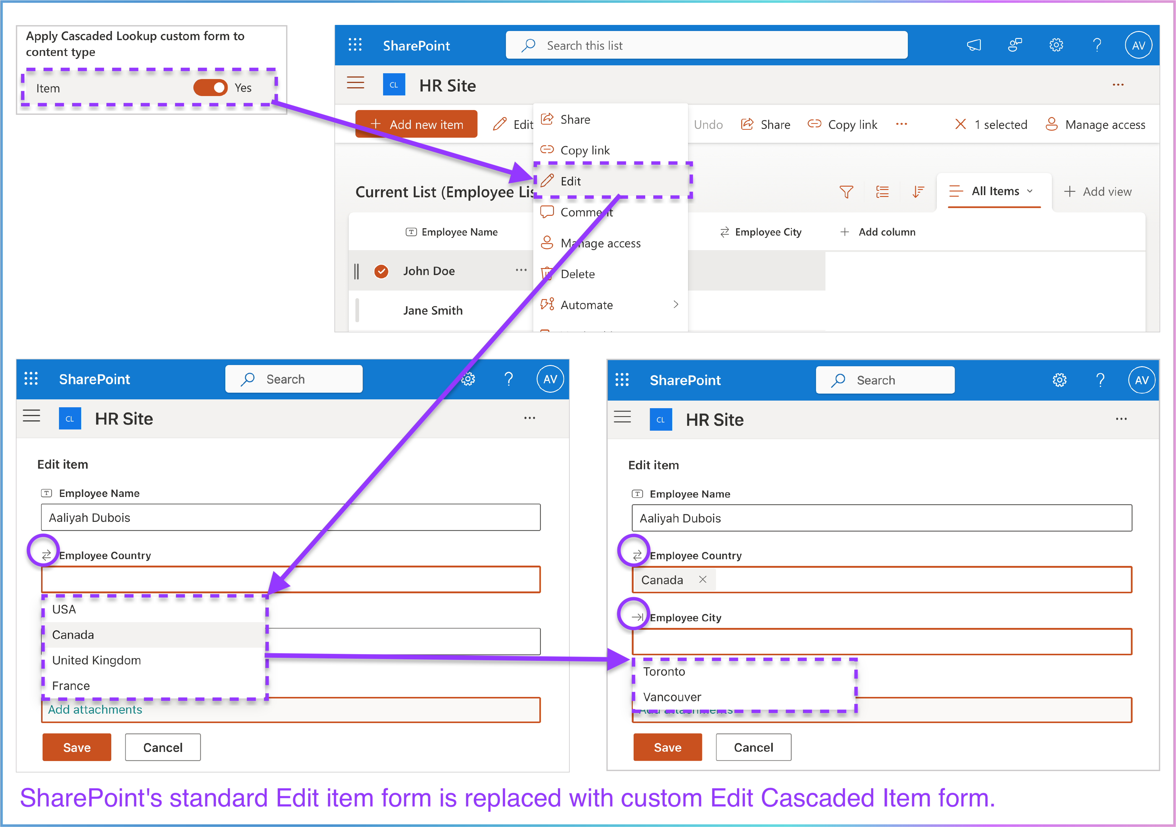
This section, located below Manage Your Cascaded Lookup Column Settings , controls how the cascading functionality integrates with your SharePoint Online list or library . It uses a simple toggle switch to determine whether the cascaded lookup custom form is applied to the content type associated with the list or library.
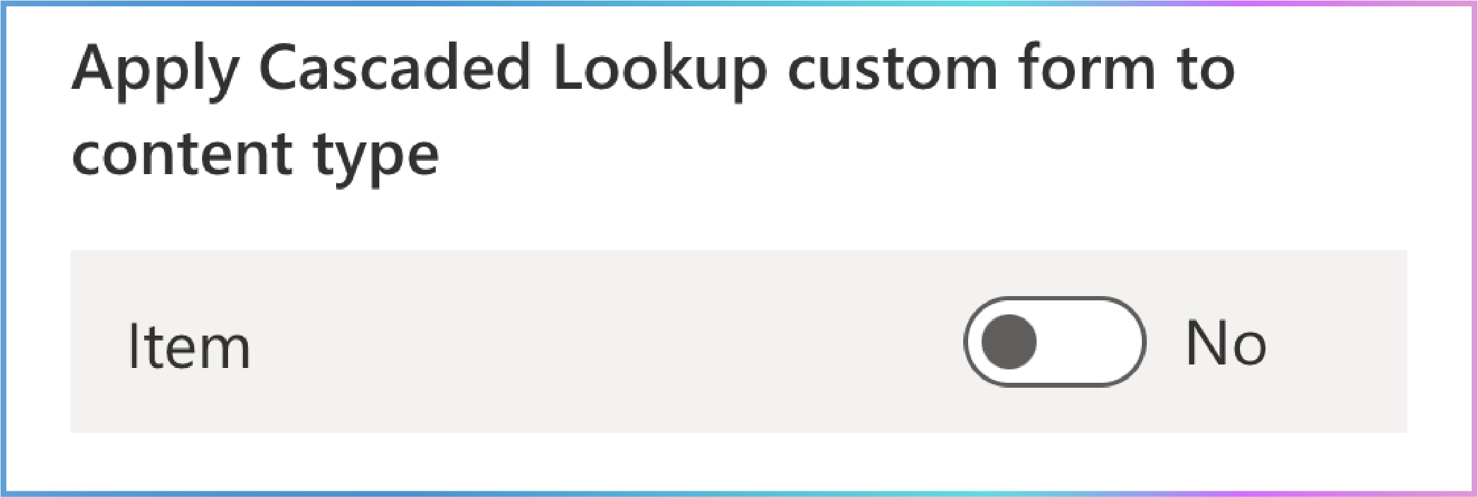
Understanding the Switch:
This is the key to a seamless user experience. SharePoint’s standard New and Edit item forms are replaced with custom New Cascaded Item and Edit Cascaded Item forms designed by the Cascaded Lookup App. This allows users to leverage cascading functionality directly when adding or modifying items using the standard + Add new item and Edit item buttons.
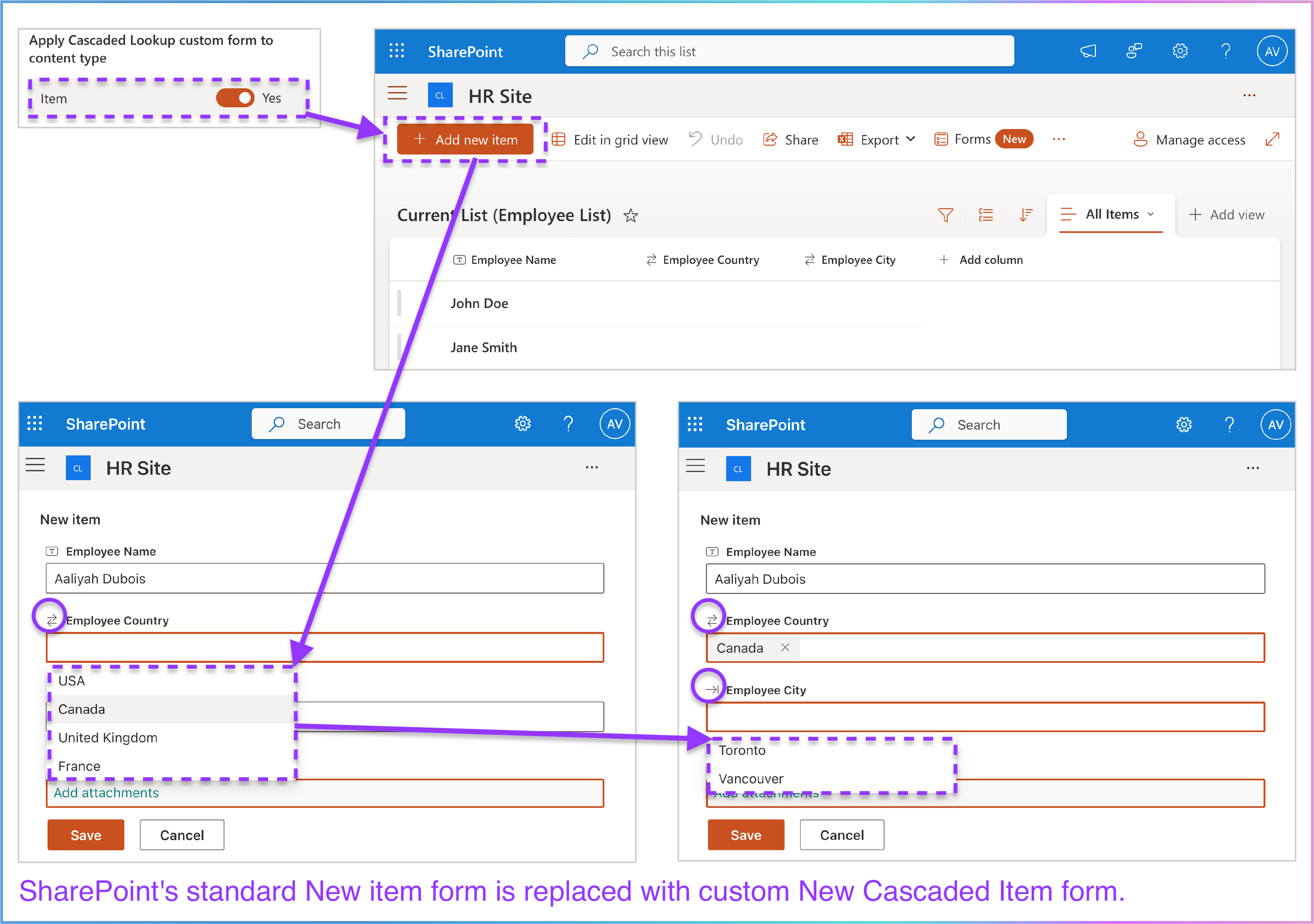
The cascaded lookup custom form is not applied to the content type. When using SharePoint’s native + Add new item and Edititem buttons to add or modify items, your cascaded lookup columns will behave like regular lookup columns, losing the cascading function. To use the cascading function, users must use the New Cascaded Item or Edit Cascaded Item commands provided by the Cascaded Lookup App on the list command bar.
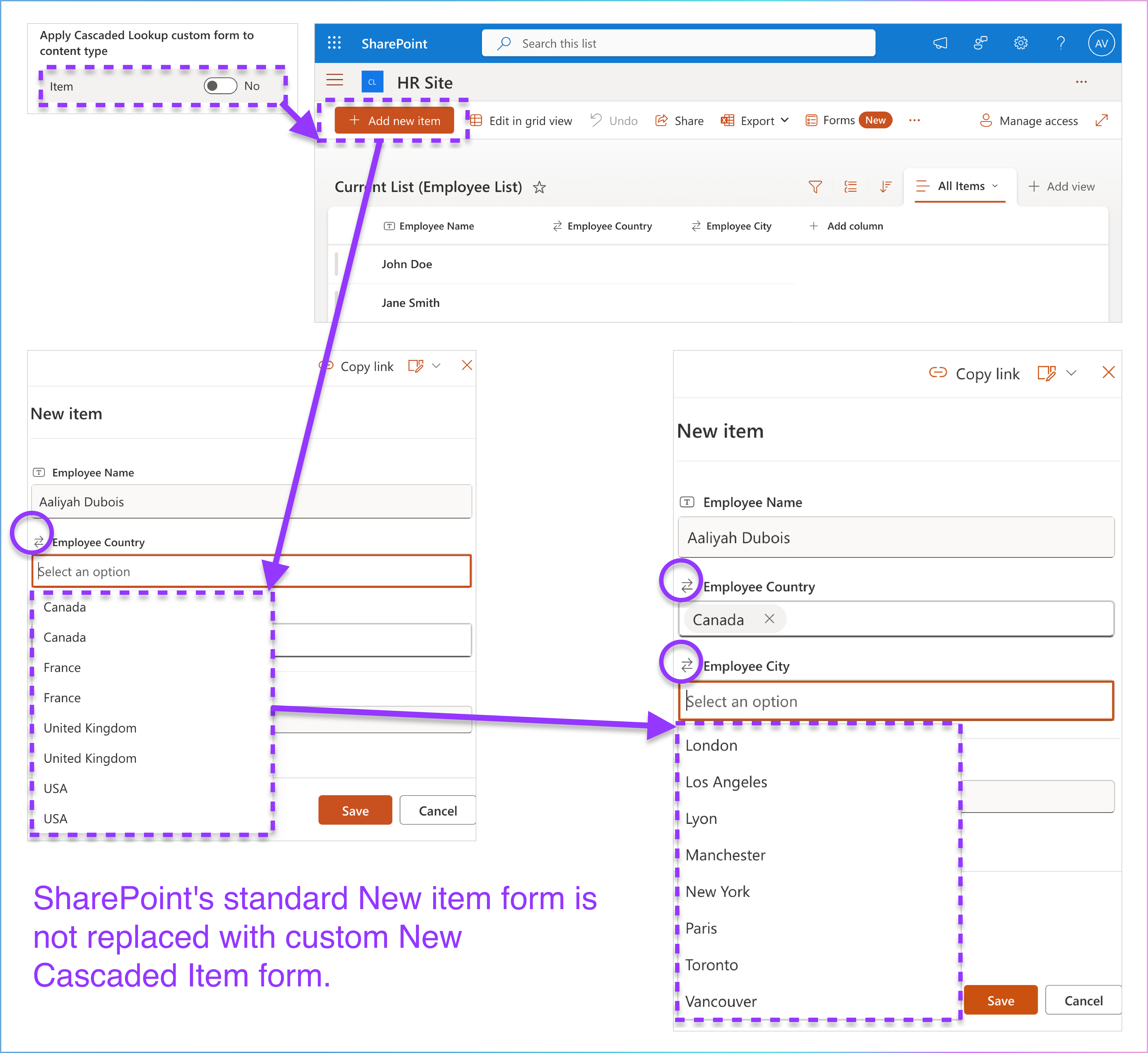
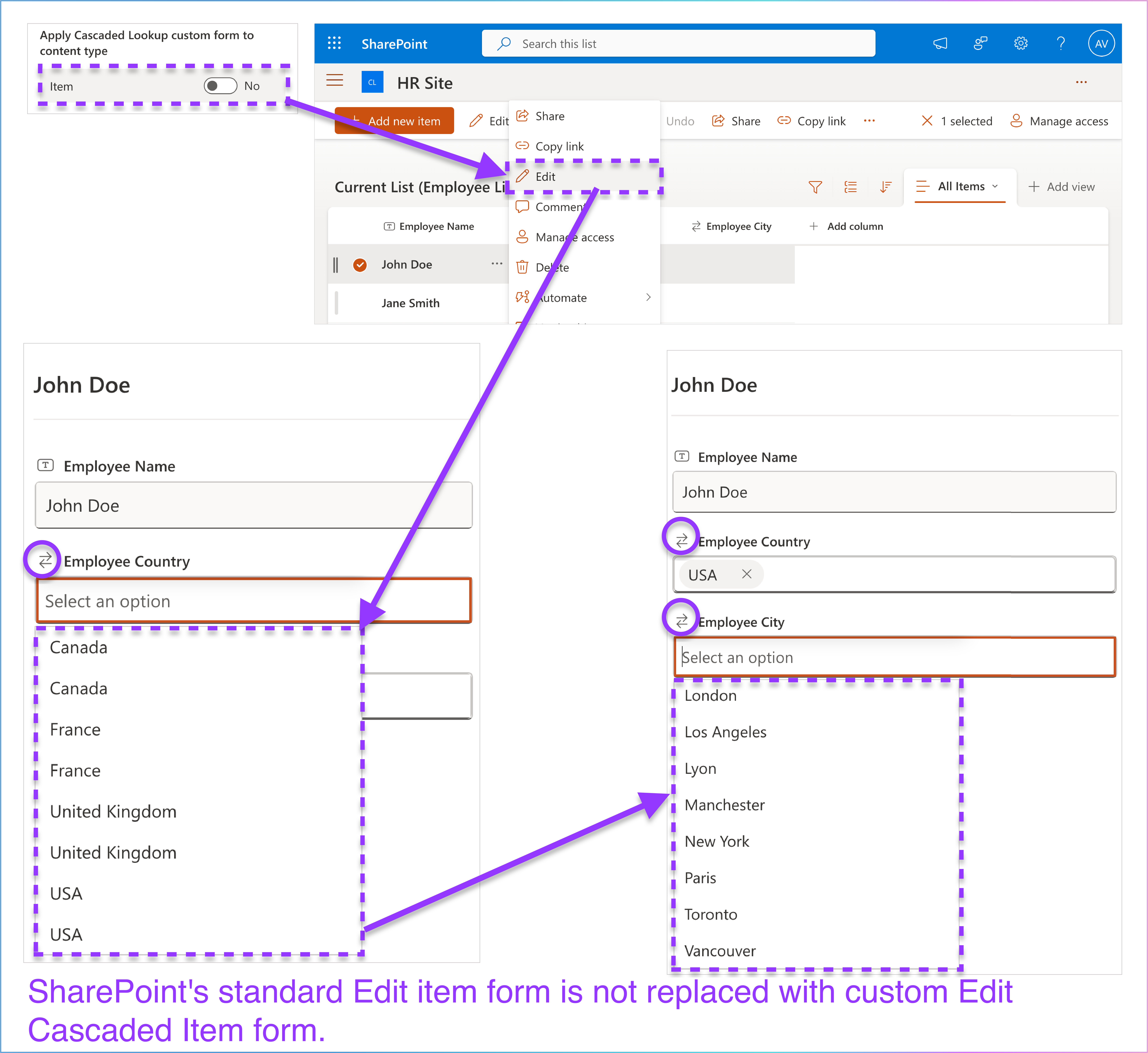
Think of it this way:
Key Considerations & Best Practices:
Two Paths to Cascading: Remember, users can always access the cascading functionality through the App commands , regardless of the switch setting. The switch simply controls whether the functionality is also available through the standard forms.
The New Cascaded Lookup Column Panel is a comprehensive interface designed to help you create and configure brand-new cascaded lookup columns from scratch in your SharePoint Online lists. This guide provides a detailed breakdown of the panel’s features, ensuring you can fully leverage its capabilities.
How to Access the Panel:
Navigate to the SharePoint Online list where you want to create cascaded lookup columns.
Click Cascaded Lookup Settings in the list command bar.
In the Manage your Cascaded Lookup column settings section, expand the Create a Cascaded Lookup Column dropdown menu.
Choose New Cascaded Lookup Column to open the panel. Select New Cascaded Lookup Column to open the setup panel.
Panel Overview:
The New Cascaded Lookup Column Panel is divided into 15 key sections, each designed to help you configure the cascaded lookup column to meet your specific needs. Use this panel to configure settings for creating a cascaded lookup column from scratch.
Below is a clear and structured breakdown of the sections in the panel.
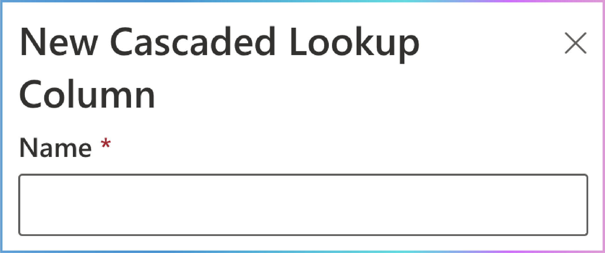
1. Name
Location: The first field at the top of the panel.
Purpose: Assign a name to your cascaded lookup column.
Appearance: Text input box.
Importance: This is a mandatory field .
Usage:
The name will appear as the column header in your list or library.
Choose a descriptive name that clearly reflects the data the column will display (e.g., "Vehicle Number" or "Product Code").
Helps users quickly understand the column’s purpose and the type of data it will contain.
Why It Matters:
Clarity and Identification: A well-chosen name ensures the column is easily identifiable and meaningful to users, reducing confusion and improving usability.
Consistency: A descriptive name helps maintain consistency across lists and libraries, making it easier for users to navigate and interact with the data.
User Experience: A clear and relevant name enhances the overall user experience by providing immediate context about the column’s purpose.
If Not Provided:
The cascaded lookup column cannot be created, as this is a mandatory field.
Users may struggle to understand the purpose of the column, leading to potential errors or misuse.
Best Practices:
Use concise and specific names (e.g., "Customer City" instead of just "City").
Avoid using technical jargon or ambiguous terms.
Ensure the name aligns with the data being retrieved and displayed in the column.

2. Description
Location: Directly below the Name field.
Purpose: Provide additional details or context about the cascaded lookup column.
Appearance: Text input box.
Importance: This is an optional field .
Usage:
The description appears as a tooltip or explanatory text, helping users understand the column’s purpose and functionality.
Use it to clarify how the column should be used or what data it represents (e.g., "This column displays the vehicle number based on selected filters like year, model, seats, and color.").
Serves as a quick reference for administrators or developers managing the list, ensuring consistent usage and reducing misunderstandings.
Why It Matters:
Clarity for Users: The description provides additional context, making it easier for users to understand the column’s purpose and how to interact with it.
Documentation: Acts as a brief documentation note for future reference, helping administrators or developers maintain and update the list.
Consistency: Ensures all users interact with the column in a consistent and informed manner, reducing errors and improving data accuracy.
If Not Provided:
Users may lack clarity about the column’s purpose, leading to potential misuse or confusion.
Administrators or developers may need to rely on external documentation to understand the column’s functionality.
Best Practices:
Keep the description concise but informative.
Include examples or specific use cases if necessary (e.g., "Select a city from the dropdown based on the chosen country.").
Avoid overly technical language to ensure it is accessible to all users.
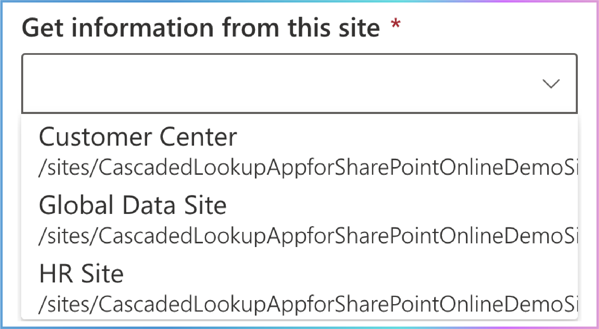
3. Get Information from This Site
Location: Directly below the Description field.
Purpose: Select the source site from which data will be retrieved. This is used for cross-site lookups within the same site collection.
Appearance: Dropdown menu.
Importance: This is a mandatory field .
Usage:
A dropdown menu displays all sites available in the current site collection.
Select the site containing the list or library you want to use as the data source.
If only the current site appears in the dropdown, it could be due to:
Permissions: You may only have access to the current site. SharePoint restricts visibility of sites based on user permissions. If you don’t have at least read access to other sites, they won’t appear in the dropdown.
Site Collection Boundary: The dropdown only lists sites within the same site collection. If your current site is the only one in the collection, it will be the only option available.
To resolve this, consider the following steps:
Check Permissions: Verify if you have access to other sites by navigating to them directly or consulting your SharePoint administrator.
Why It Matters:
Data Source Selection: It allows you to specify the exact site within the current site collection that contains the list or library you want to use as your data source. This ensures that the data being retrieved is relevant and accurate for your lookup needs.
Flexibility and Precision: By selecting the appropriate site, you gain the flexibility to pull data from various sources within your site collection, allowing for more precise and tailored data integration.
Consistent Data Retrieval: Ensuring the correct site is selected helps maintain consistency in data retrieval, preventing errors or mismatches that could occur if data were sourced from an incorrect location.
Efficient Data Management: It streamlines the process of managing and accessing data across multiple sites, making it easier to integrate and utilize data effectively within your workflows.
If Not Selected:
The cascaded lookup column will not have a defined data source.
You will not be able to proceed to the next steps in the setup configuration.
The cascaded lookup functionality will remain incomplete and non-functional.
Note: After the cascaded lookup column is successfully established , the "Get information from this site" field cannot be edited.
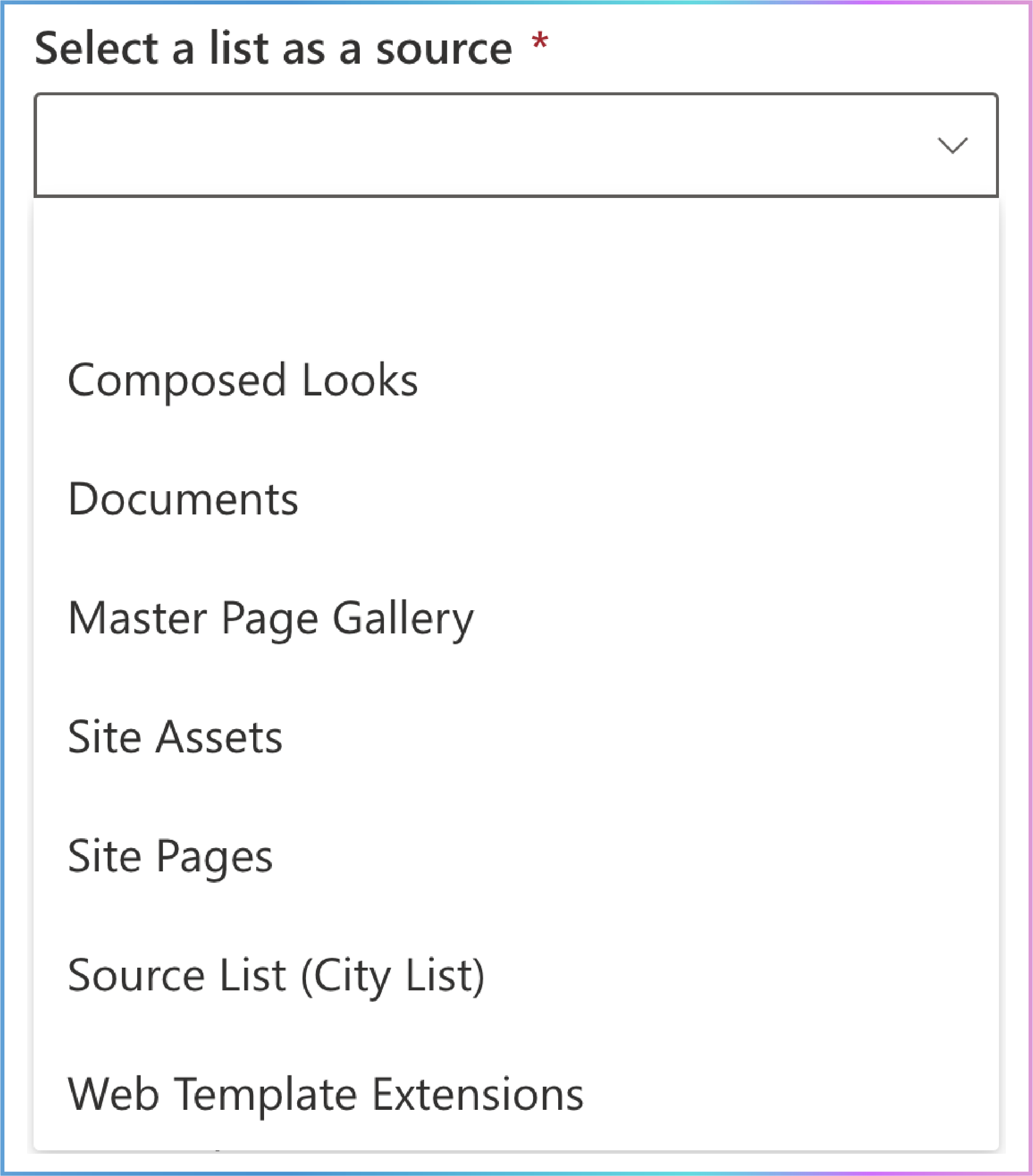
4. Select a List as a Source
Location: Directly below the Get information from this site option.
Purpose: Specify the list that will act as the data source for the cascaded lookup column.
Appearance: Dropdown menu.
Importance: This is a mandatory field .
Usage:
A dropdown menu displays all available lists within the selected site.
Users can choose one of these lists as the source for retrieving information.
The dropdown includes:
Custom Lists: Lists created by users.
System Libraries and Lists: Default lists generated by SharePoint for site functionality. Examples include:
Documents: A default library for storing files.
Site Assets: Stores files used on site pages, such as images and scripts.
Site Pages: Contains pages for the site.
User Information List: Stores details about users who have accessed the site.
TaxonomyHiddenList: Used by the Managed Metadata service to store terms.
Composed Looks: Stores themes and designs for the site.
Master Page Gallery: Contains master pages and page layouts.
Style Library: Stores stylesheets and related resources.
Web Part Gallery: Contains web parts for use on pages.
Solutions Gallery, Theme Gallery, Web Template Extensions: Various galleries for solutions, themes, and extensions.
App-Related Lists: Lists used internally for app functionality (e.g., AppData, AppFiles).
Other Lists: Lists serving specific purposes (e.g., Converted Forms, Form Templates, List Template Gallery).
The lists displayed may vary depending on the type of site selected in the Get information from this site option.
Why It Matters:
Data Source Accuracy: Ensures the cascaded lookup column retrieves data from the correct and relevant list.
Flexibility: Provides a wide range of list options, including both custom and system-generated lists, enabling powerful cascading functionality.
Integration: Allows seamless integration and synchronization of data across different lists within SharePoint.
Enhanced Functionality: Expands on SharePoint’s native lookup column capabilities by adding hierarchical filtering and more data source options.
If Not Selected:
The cascaded lookup column will not have a defined data source.
You will not be able to proceed to the next steps in the setup configuration.
The cascaded lookup functionality will remain incomplete and non-functional.
Note: After the cascaded lookup column is successfully established, the "Select a list as a source" field cannot be edited.
Why Are System Lists Visible?
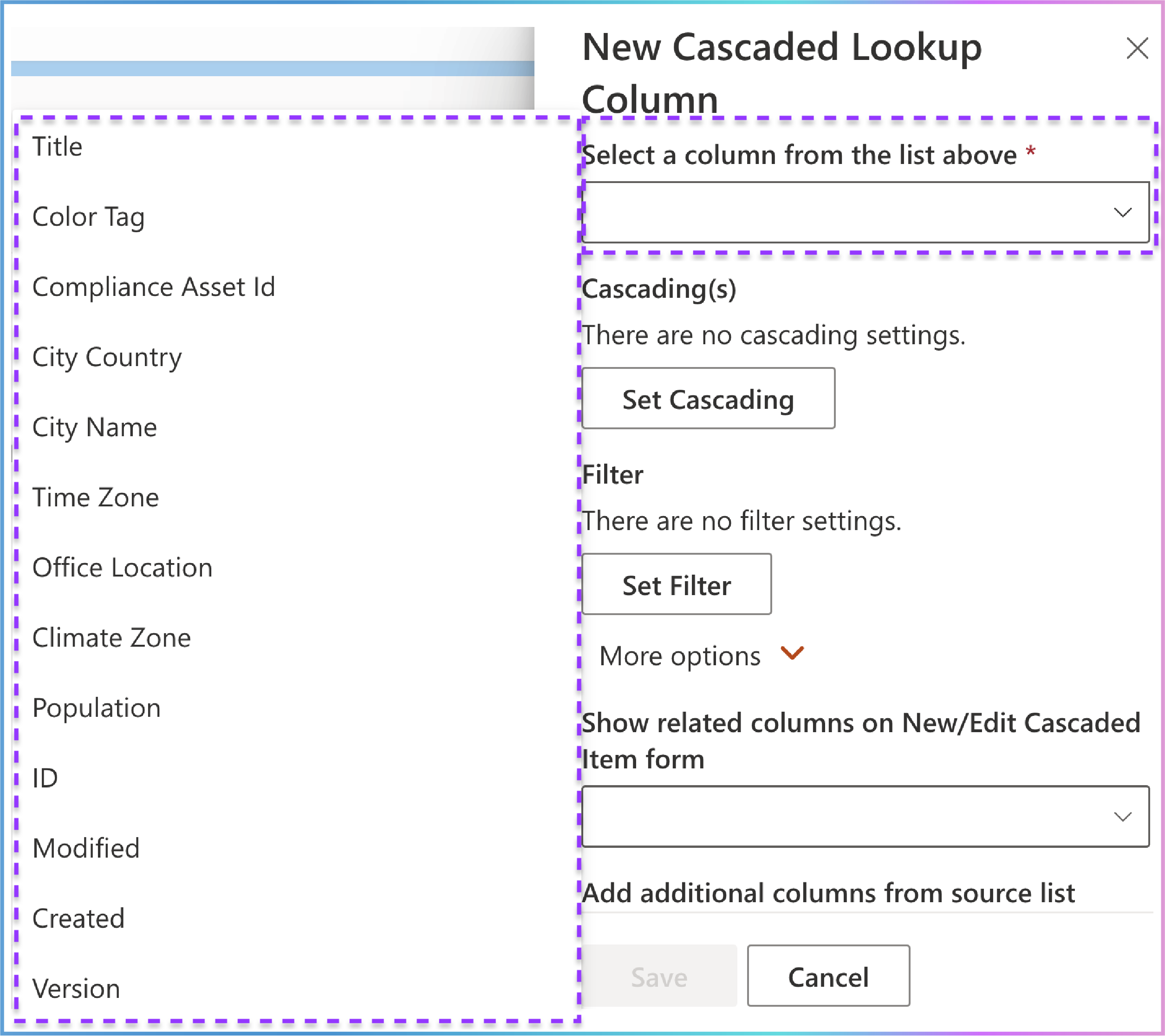
5. Select a Column from the List Above
Location: Directly below the Select a list as a source option.
Purpose: Specify the column from the selected list that will act as the data source for the cascaded lookup column.
Appearance: Dropdown menu.
Importance: This is a mandatory field .
Usage:
A dropdown menu displays all available columns within the selected list.
Users can choose one of these columns as the source for retrieving information.
The dropdown includes:
Custom Columns: Columns created by users.
System Columns: Default columns generated by SharePoint for list functionality. Examples include:
Color Tag
Compliance Asset Id
ID
Modified
Created
Version
The columns displayed may vary depending on the type of list selected in the Select a list as a source option.
Why It Matters:
Data Source Accuracy: Ensures the cascaded lookup column retrieves data from the correct and relevant column.
Flexibility: Provides a wide range of column options, including both custom and system-generated columns, enabling powerful cascading functionality.
Integration: Allows seamless integration and synchronization of data across different columns within the selected list.
Enhanced Functionality: Expands on SharePoint’s native lookup column capabilities by adding hierarchical filtering and more data source options.
If Not Selected:
The cascaded lookup column will not have a defined data source.
You will not be able to proceed to the next steps in the setup configuration.
The cascaded lookup functionality will remain incomplete and non-functional.
Note: After the cascaded lookup column is successfully established , the "Select a column from the list above" field is editable. You can change it to specify another column to retrieve data from. To do this:
Click the existing cascaded lookup column under the Create a Cascaded Lookup Column dropdown to enter the Edit Cascaded Lookup Column panel.
Locate the Select a column from the list above field.
Select another column from the dropdown menu according to your needs.
Supported Column Types:
The Select a column from the list above option supports the following column types (source column types):
Single Line of Text
Number
Date and Time
Calculated (output is single line of text)
ID
Modified
Created
Version
Why Are System Columns Visible?
6. Cascading(s)
The Cascading(s) section is a critical part of the setup. It allows you to define how the parent and child columns interact, ensuring that the options in the child column are filtered based on the selection in the parent column.
Location: The Cascading(s) section is located directly below the "Select a column from the list above" option.
Purpose: Establish the cascading behavior for the cascaded lookup column. It defines how the parent column (e.g., Country) filters the options in the child column (e.g., City).
Importance: This is the core section of the Cascaded Lookup App. It allows you to configure the relationship between the parent and child columns, ensuring that the child column displays only relevant options based on the parent column’s selection.
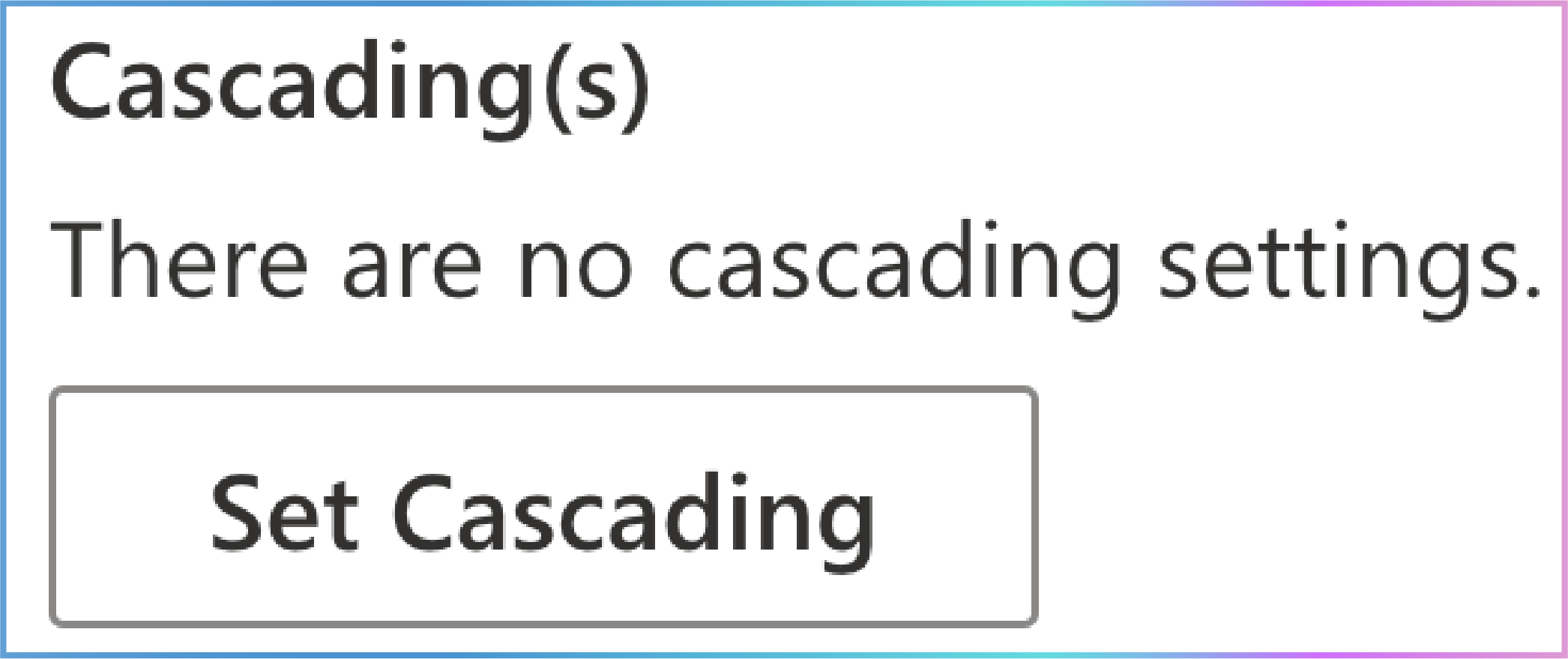
Default State: If no cascading settings are configured, the section will display: "There are no cascading settings."
Cascading Behavior Overview
Cascading behavior enables you to create dependent dropdowns in a SharePoint list. This means the options in one dropdown (the child column) are filtered based on the selection in another dropdown (the parent column).
Example:
Setting Up Cascading
Click "Set Cascading":
This opens the Set Cascading panel.
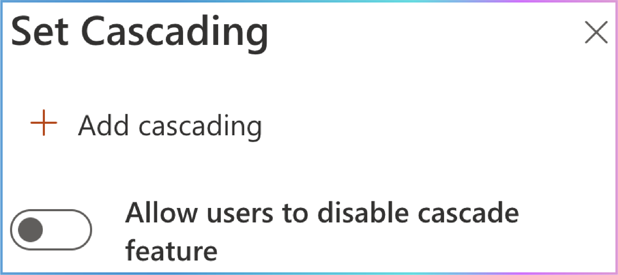
In this panel, you will see:
A +Add cascading button to create a new cascading configuration.
A switch button labeled "Allow users to disable cascade feature" , which you can toggle on or off.
Click "+Add Cascading":
This creates a new Cascading Configuration Box .

In this box, you can specify:
Parent column in this list: The column in your current list that controls the filtering.
Filter by column in source list: The column in the source list that matches the parent column and filters the child column.
Key Components of Cascading Configuration
1. Parent Column in This List
Location: This column is in your current list (the list where you’re setting up the cascading behavior).
Role: Acts as the filter that controls what options are shown in the child column.
Example: In your current list, you might have an Employee Country column. When you select a country (e.g., USA), it will filter the options in the child column (e.g., Employee City).
Supported Column Types:
Choice (Except when using the filled-in value mode ).
SharePoint Lookup.
Cascaded Lookup.
2. Filter by Column in Source List
Location: This column is in the source list (the list where the data is pulled from).
Role: Used to compare with the parent column and filter the values displayed in the child column.
Example: In the source list, you might have a City Country column that corresponds to the Employee Country column in your current list. The app uses this column to filter the Employee City values based on the selected country.
Supported Column Types:
Choice.
Single Line of Text.
SharePoint Lookup (Single value only. The source column must not be of type Number or Date and Time ).
Cascaded Lookup (Single value only. The source column must not be of type Number or Date and Time ).
How Parent and Filter Columns Work Together
Parent Column in This List (Current List):
Filter by Column in Source List:
The app looks at the City Country column in the source list and finds all rows where the City Country matches the selected value (e.g., USA).
Child Column (Current List):
The app then filters the Employee City column in your current list to only show cities that belong to the selected country (e.g., New York , Los Angeles).
Example Scenario
Current List (Employee List):
| Employee Name | Employee Country (Parent) | Employee City (Child) |
|---|---|---|
| John Doe | USA | New York |
| Jane Smith | Canada | Toronto |
Source List (City List):
| City Name | City Country (Filter by Column) |
|---|---|
| New York | USA |
| Los Angeles | USA |
| Toronto | Canada |
| Vancouver | Canada |
Steps to Set Up Cascading:
Parent Column in This List:
In your current list, select Employee Country as the parent column.
Filter by Column in Source List:
In the source list, select City Country as the filter column.
Result:
When you select an Employee Country in your current list, the Employee City dropdown will only show cities from that country.
Cascading Behavior in Action
When you select USA in the Employee Country column (Parent) in the Employee List, the Employee City column (Child) will only show New York and Los Angeles (filtered based on the City Country column in the Source List).
Simplified Explanation
Parent Column in This List: The column in your current list that controls the filtering (e.g., Employee Country ).
Filter by Column in Source List: The column in the source list that matches the parent column and is used to filter the child column (e.g., City Country in the source list).
Child Column: The column whose values are filtered based on the parent column (e.g., Employee City ).
Key Takeaway
The Parent Column in This List and Filter by Column in Source List are related but not the same.
The Parent Column in This List is in your current list and controls the filtering.
The Filter by Column in Source List is in the source list and is used to filter the values displayed in the Child Column.
Why This Matters
Data Consistency:
Ensures that only valid and related data is displayed in the dropdowns.
Prevents users from selecting mismatched or incorrect data (e.g., selecting a city that doesn’t belong to the selected country).
User Experience:
Makes it easier for users to select accurate and relevant data.
Reduces confusion and errors in data entry.
Advanced Cascading with Multiple Parent Columns
You can click +Add cascading to set up multiple parent columns and corresponding filter columns to control the values in the cascaded lookup column (the child column). This cascading behavior becomes even more powerful when multiple parent columns and corresponding filter columns are used to control the values in a child column. By setting up multiple parent columns in the current list and linking them to filter columns in the source list, we can create a highly granular and specific filtering mechanism. This approach allows the child column to display only those options that meet all the selected criteria across the parent columns, ensuring data accuracy and relevance.
Example Scenario: Cascaded Lookup Columns with Multiple Parent Columns
In this example, we will set up a cascading relationship between the Source List(Inventory Vehicles) and the Current List (The Vehicle the Customer Wants to Know About). The Current List will use multiple parent columns (Year of Production, Car Model, Number of Seats, and Color) to filter the Child Column (Vehicle Number) based on the corresponding filter columns in the Source List.
Source List: Inventory Vehicles
| Year of Production (Filter by Column 1) | Car Model (Filter by Column 2) | Number of Seats (Filter by Column 3) | Color (Filter by Column 4) | Vehicle Number |
|---|---|---|---|---|
| 2020 | Model X | 5 | Red | VIN001 |
| 2020 | Model X | 5 | Blue | VIN002 |
| 2021 | Model Y | 7 | Black | VIN003 |
| 2021 | Model Y | 5 | White | VIN004 |
| 2022 | Model Z | 5 | Red | VIN005 |
| 2022 | Model Z | 7 | Blue | VIN006 |
Current List: The Vehicle the Customer Wants to Know About
| Customer Name | Contact Number | Year of Production (Parent 1) | Car Model (Parent 2) | Number of Seats (Parent 3) | Color (Parent 4) | Vehicle Number (Child) |
|---|---|---|---|---|---|---|
| John Doe | 123-456-7890 | |||||
| Jane Smith | 987-654-3210 |
Cascading Behavior
Parent Columns in Current List:
The customer selects values for the following parent columns:
Year of Production (Parent 1): E.g., 2021
Car Model (Parent 2): E.g., Model Y
Number of Seats (Parent 3): E.g., 5
Color (Parent 4): E.g., White
Filter by Columns in Source List:
The app looks at the Year of Production , Car Model, Number of Seats , and Color columns in the Source List.
It finds rows where all these values match the selected criteria (e.g., 2021, Model Y, 5, White).
Child Column in Current List:
Example Interaction
Step 1: In the Current List, the customer selects:
Year of Production: 2021
Car Model: Model Y
Number of Seats: 5
Color: White
Step 2: The app filters the Source List to find rows where:
Year of Production = 2021
Car Model = Model Y
Number of Seats = 5
Color = White
The matching row in the Source List is:
| Year of Production | Car Model | Number of Seats | Color | Vehicle Number |
| 2021 | Model Y | 5 | White | VIN004 |
Updated Current List After Filtering
| Customer Name | Contact Number | Year of Production (Parent 1) | Car Model (Parent 2) | Number of Seats (Parent 3) | Color (Parent 4) | Vehicle Number (Child) |
|---|---|---|---|---|---|---|
| John Doe | 123-456-7890 | 2021 | Model Y | 5 | White | VIN004 |
| Jane Smith | 987-654-3210 |
How It Works Together
Parent Columns in Current List: These columns act as filters, controlling the options shown in the Child Column (Vehicle Number).
Filter by Columns in Source List: These columns are compared with the parent columns to filter the values displayed in the Child Column.
Child Column in Current List: This column dynamically updates based on the selected values in the parent columns, ensuring only relevant options are displayed.
By setting up multiple parent columns and linking them to corresponding filter columns in the source list, we create a cascaded lookup system that allows for precise and context-aware filtering of the child column based on multiple criteria. This ensures that customers are presented with accurate and relevant vehicle options, improving the overall user experience.
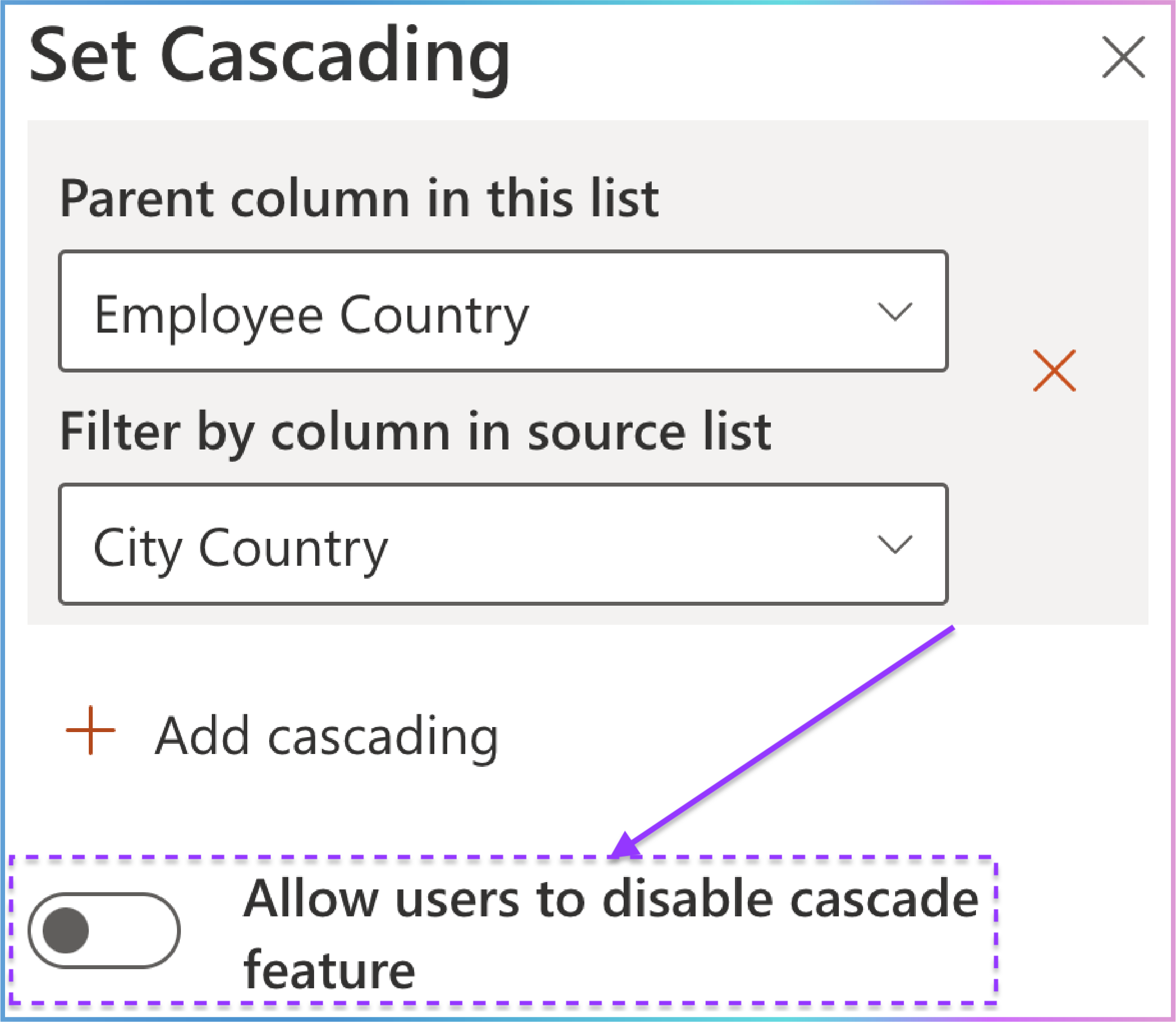
For the Switch Button: "Allow Users to Disable Cascade Feature"
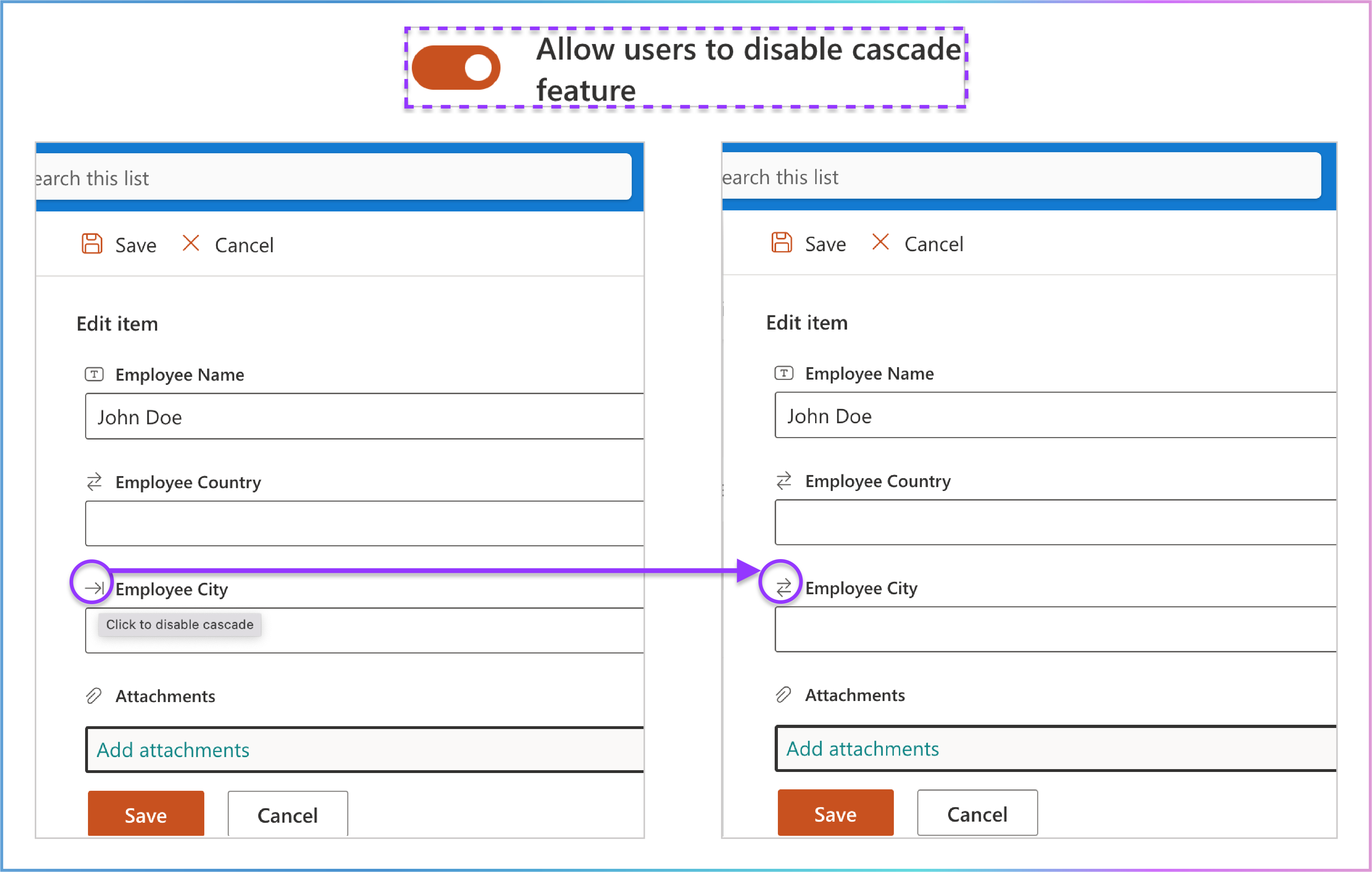
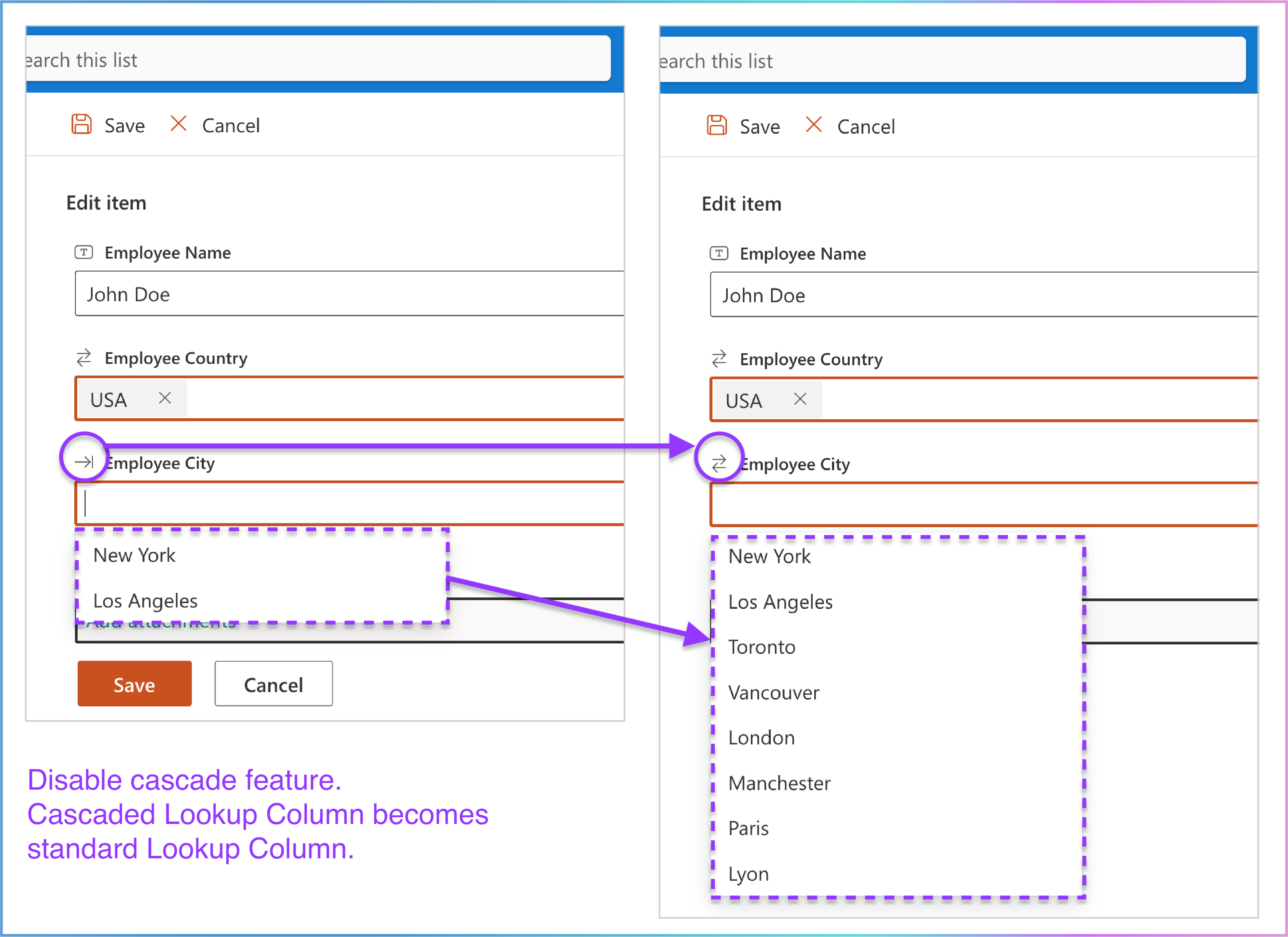
By enabling the Allow users to disable cascade feature option, users gain the ability to disable the cascade functionality when working with Cascaded Lookup columns in the New or Edit cascaded item form .
How It Works:
In the New or Edit cascaded item form , locate the cascaded lookup column.
Hover your mouse over the small
right-facing arrow
icon
( ) displayed before the cascaded lookup column name.
A tooltip labeled "Click to disable cascade" will appear, indicating that clicking the icon will disable the cascade feature for that specific column.
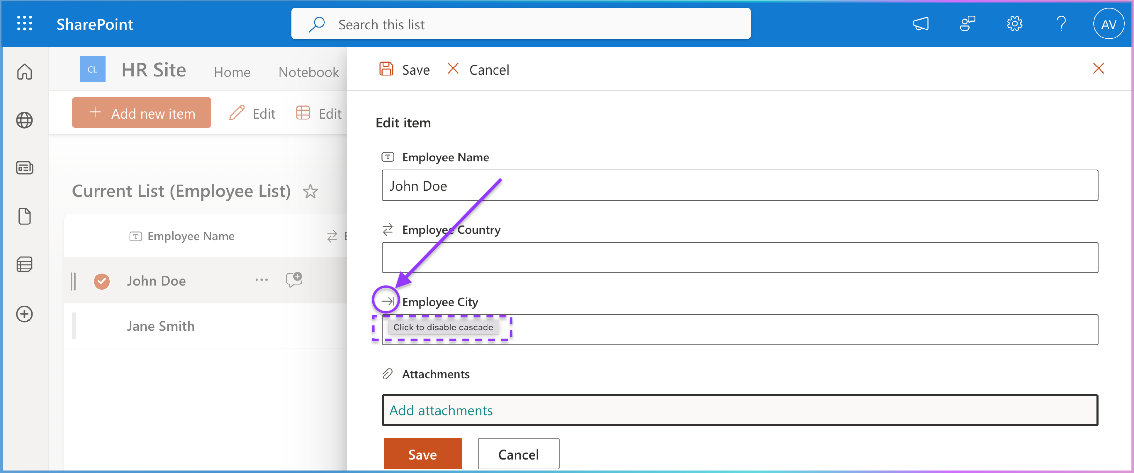
Once disabled, the column will behave as a standard ookup column, no longer applying cascading filters.
7. Filter
The Filter section allows you to refine the options available in the cascaded lookup column based on a selected view or specific columns in the source list. This feature ensures that users see only the most relevant data, improving accuracy and usability.
Key Details:
Location: Directly below the Cascading(s) option.
Purpose: Specify whether the options in the cascaded lookup column can be filtered based on a selected view or by selected columns in the source list.
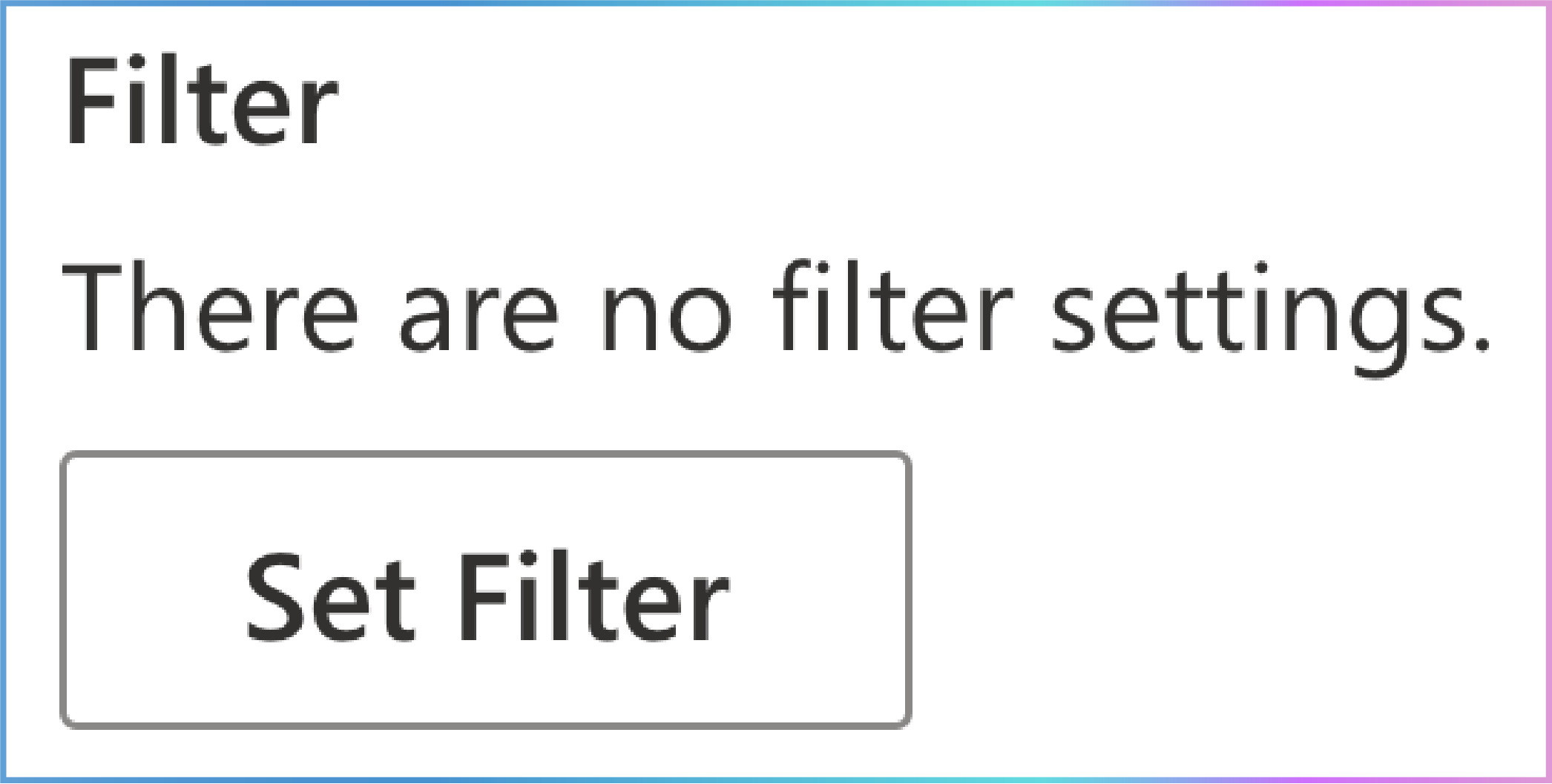
Default State: If no filter settings are configured, it will display: "There are no filter settings."
Setting Up Filters
To configure filters, follow these steps:
Click "Set Filter":
This opens the Set Filter panel.

The panel has two main sections:
Filter items by a view: View Filtering (The Broad Stroke) and Sorting (The Order of Presentation).
Allow users to filter items using columns: Column-Based Filtering (The Fine-Grained Control).
1. Filter Items by a View (View Filtering)
Location: The first section in the Set Filter panel.
Purpose: Filter the options available in the cascaded lookup column based on a specific view in the source list.
Usage:
A dropdown menu displays all public views of the source list.
Select a specific view, and only items belonging to that view in the source list will be available for retrieval in the cascaded lookup column.
Additional Option (Putting Things in Order):
2. Allow Users to Filter Items Using Columns (Column-Based Filtering: User-Defined Refinement)
Location: The second section in the Set Filter panel.
Purpose: Refine the available choices in your cascaded lookup column by filtering based on selected columns in the source list.
Usage:
Select Columns for Filtering: In the Allow Users to Filter Items Using Columns section, check the boxes next to the columns in the source list that you want to use for filtering.
Define Filtering Criteria (New/Edit Cascaded Item Forms) : When creating a new cascaded lookup item or editing an existing one, you’re presented with filtering options for the selected columns. You can apply specific criteria (e.g., contains, begins with , equal, not equal) to narrow down the choices.
Supported Column Types:
Choice: Select a specific value from the available choices.
Single Line of Text: Enter text to match.
SharePoint Lookup: Select a specific value from the linked list.
Filtering Options Explained:
For Choice or SharePoint Lookup Columns :
For Single Line of Text Columns:
Enter text directly into the filter field. The following comparison operators are used to find matching items:
 contains
: Matches any item containing the entered text (e.g.,
"apple" will match "pineapple").
 begins with
: Matches items starting with the entered text
(e.g., "app" will match "apple").
 equal
: Matches items with an exact match to the entered
text.
 not equal
: Matches items that do not have an exact match to the
entered text.
Step-by-Step Filter Process with Sorting and Column Filtering
This section guides you through the step-by-step process of using the Filter option in the New Cascaded Lookup Column panel. We’ll start with filtering by a view, then add sorting, and finally combine it with column-based filtering.
1. Filter Items by a View
Purpose:
Filter the options available in the cascaded lookup column based on a specific view in the source list.
Example Scenario:
| City | Country (Filter by Column) | Population |
|---|---|---|
| New York | USA | 8,400,000 |
| Los Angeles | USA | 3,900,000 |
| Toronto | Canada | 2,900,000 |
| Vancouver | Canada | 2,500,000 |
| Berlin | Germany | 3,700,000 |
| Munich | Germany | 1,500,000 |
| Employee Name | Country (Parent) | City (Child) |
|---|---|---|
| John Doe | USA | |
| Jane Smith | Canada | |
| Alice Brown | Germany |
Step-by-Step Setup:
Click "Set Filter":
Open the Set Filter panel.
Select a View:
Choose a view named
"Large Cities with a population
greater than 3,000,000"
from the
Filter items by a
view
dropdown menu.
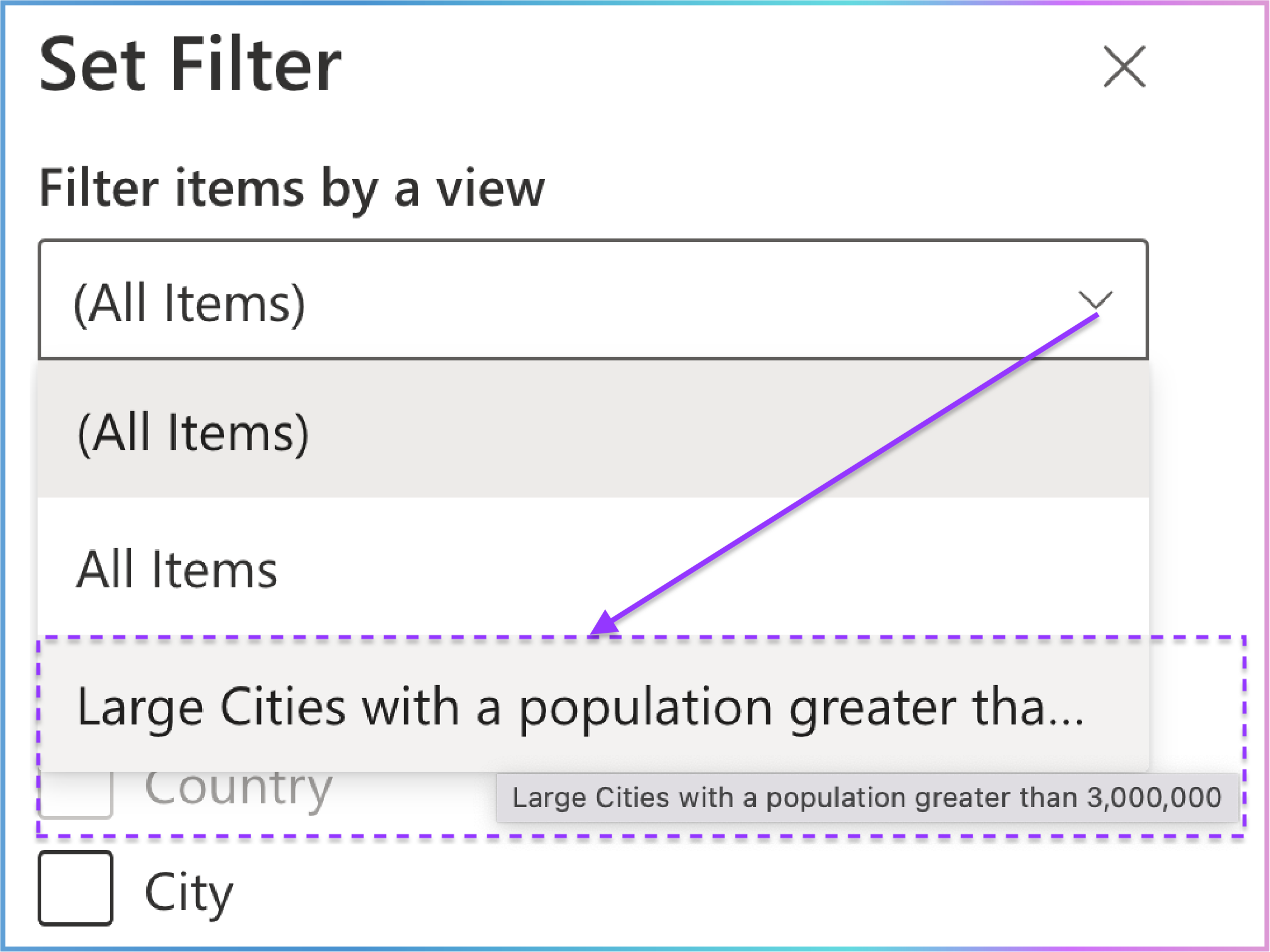
This view filters cities with a population greater than 3,000,000.
| City | Country (Filter by Column) | Population |
|---|---|---|
| New York | USA | 8,400,000 |
| Los Angeles | USA | 3,900,000 |
| Berlin | Germany | 3,700,000 |
The filtered cities in the source list are:
New York (USA)
Los Angeles (USA)
Berlin (Germany)
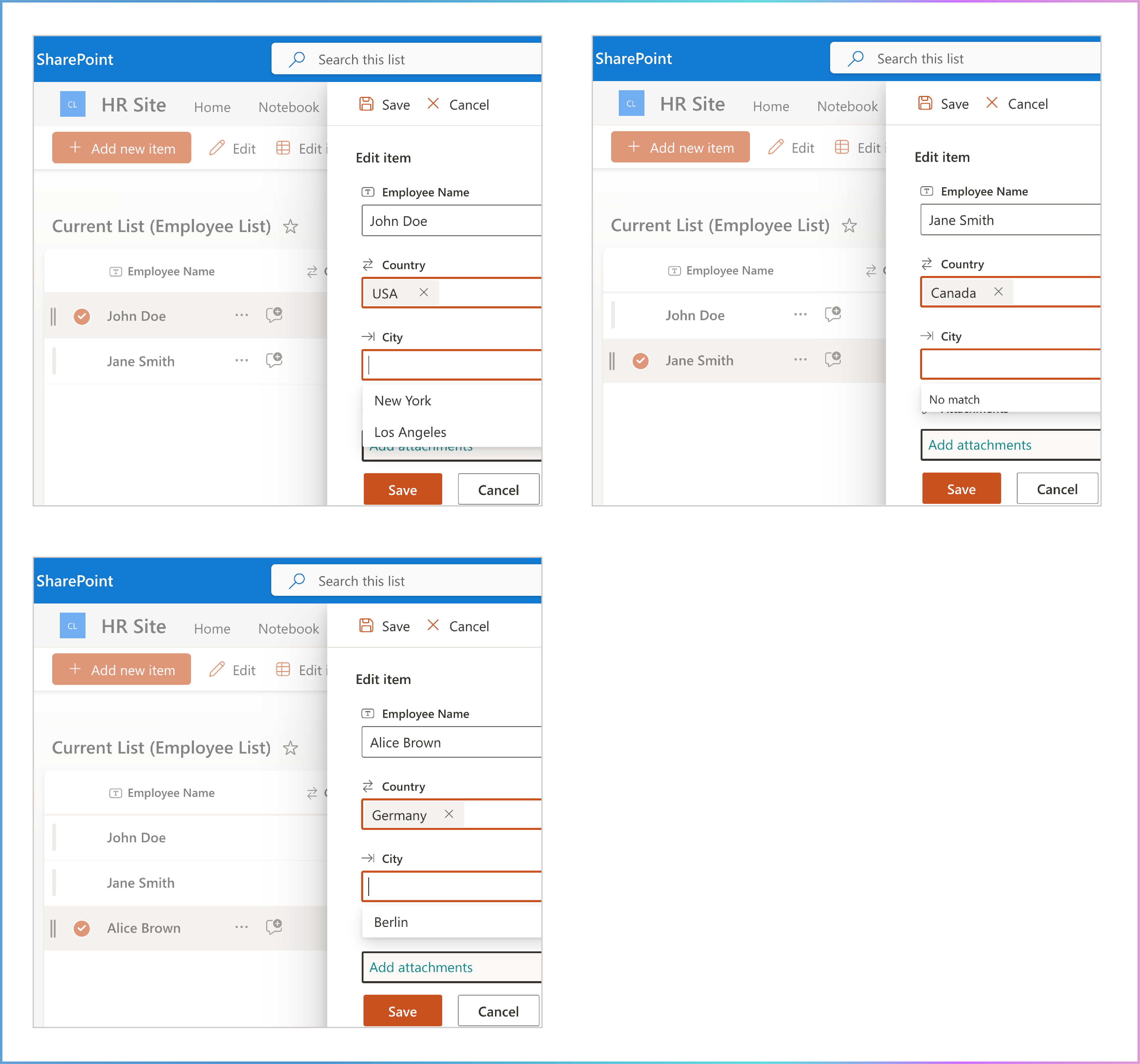
Result:
The City dropdown in the Employee List will only show the filtered cities:
New York (USA)
Los Angeles (USA)
Berlin (Germany)
Visual Example:
| Employee Name | Country (Parent) | City (Child) |
|---|---|---|
| John Doe | USA | New York |
| Jane Smith | Canada | |
| Alice Brown | Germany | Berlin |
2. Filter Items by a View + Use Selected View to Sort Items
Purpose:
Apply the sorting order defined in the selected view to the items displayed in the cascaded lookup column.
Example Scenario:
View: "Large Cities with a population greater than 3,000,000 (Descending)"
This view sorts cities by Population in descending order.
The sorted list in this view would look like this:
| City | Country (Filter by Column) | Population |
|---|---|---|
| New York | USA | 8,400,000 |
| Los Angeles | USA | 3,900,000 |
| Berlin | Germany | 3,700,000 |
New York (8,400,000)
Los Angeles (3,900,000)
Berlin (3,700,000)
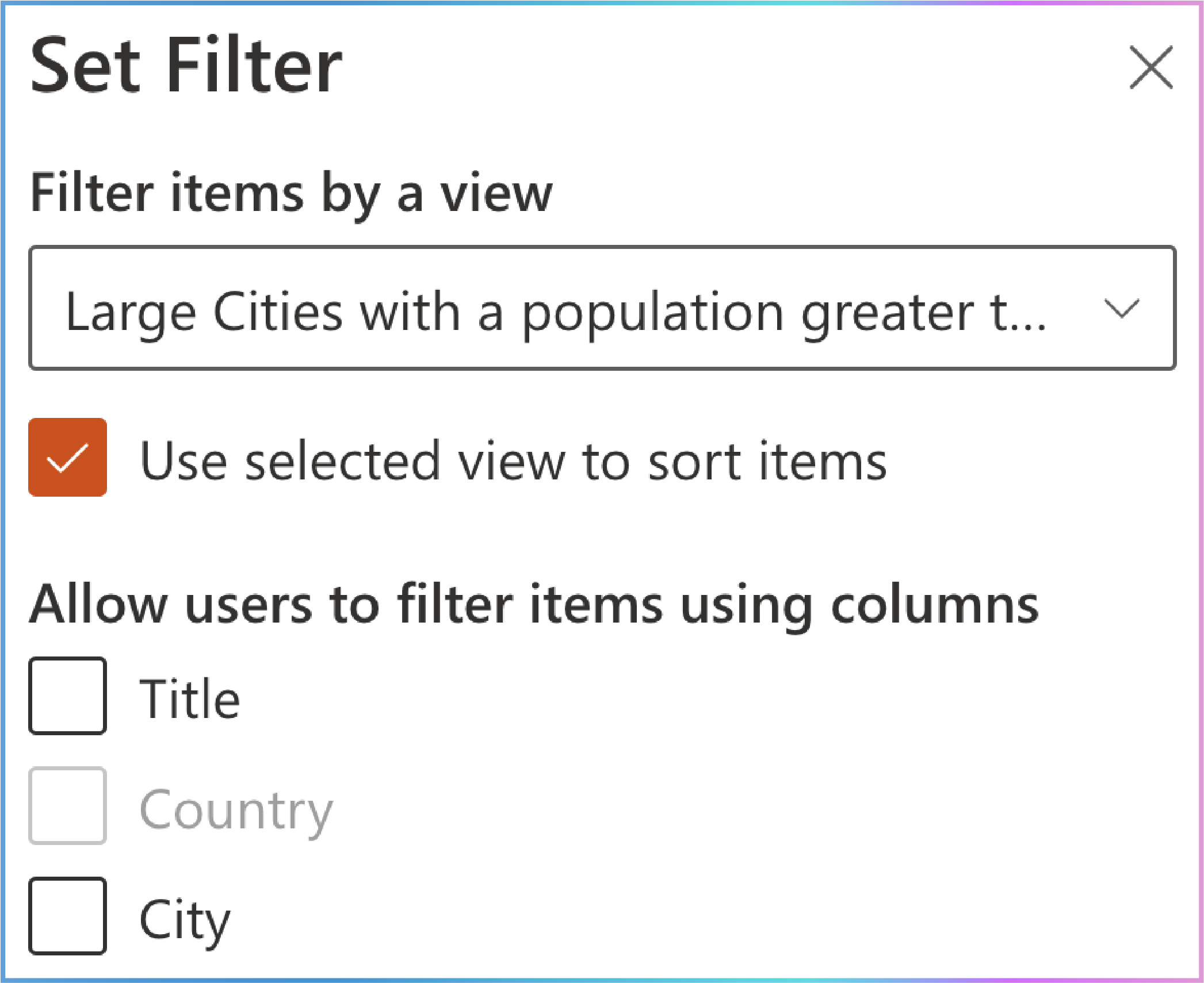
Step-by-Step Setup:
Select the View:
Enable Sorting:
Check the Use selected view to sort items checkbox.
Result:
The City dropdown in the
Employee
List
will display cities in the following order:
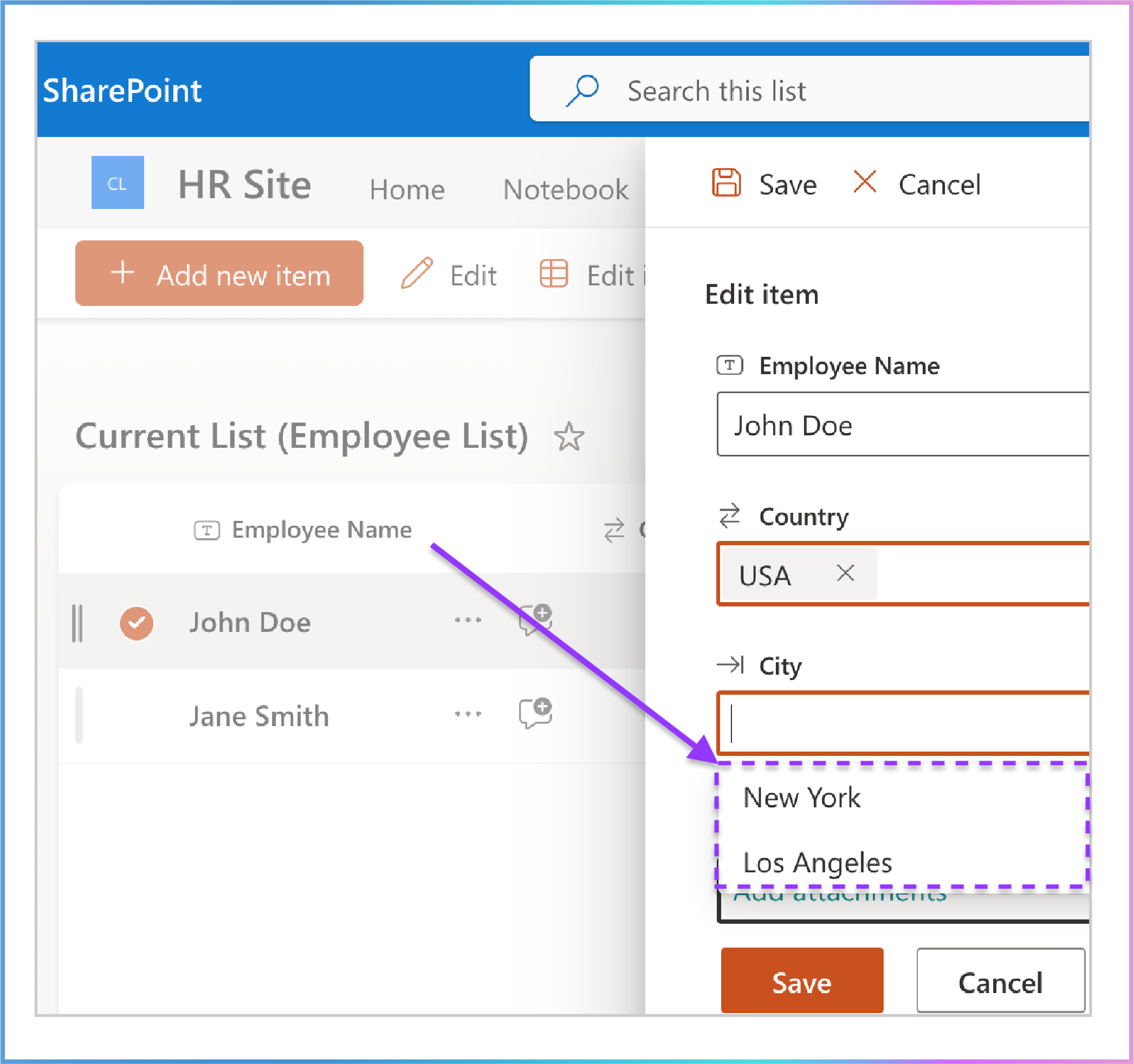
New York (USA)
Los Angeles (USA)
Berlin (Germany)
Visual Example:
| Employee Name | Country (Parent) | City (Child) |
|---|---|---|
| John Doe | USA | New York |
| Jane Smith | Canada | |
| Alice Brown | Germany | Berlin |
3. Filter Items by a View + Use Selected View to Sort Items + Allow Users to Filter Items Using Columns
Purpose:
Further refine the options by adding column-based filters while maintaining the sorting order defined in the selected view.
Example Scenario:
Filter by Column:
Select the City column in the Allow Users to Filter Items Using Columns section.
Choose the contains operator and type New.
Step-by-Step Setup:
Select the View:
In the Set Filter panel, select the "Large Cities with a population greater than 3,000,000 (Descending)" view from the Filter items by a view dropdown menu.
Enable Sorting:
Check the Use selected view to sort items checkbox.
Apply Column-Based Filters:
Select the City column in the Allow Users to Filter Items Using Columns section.
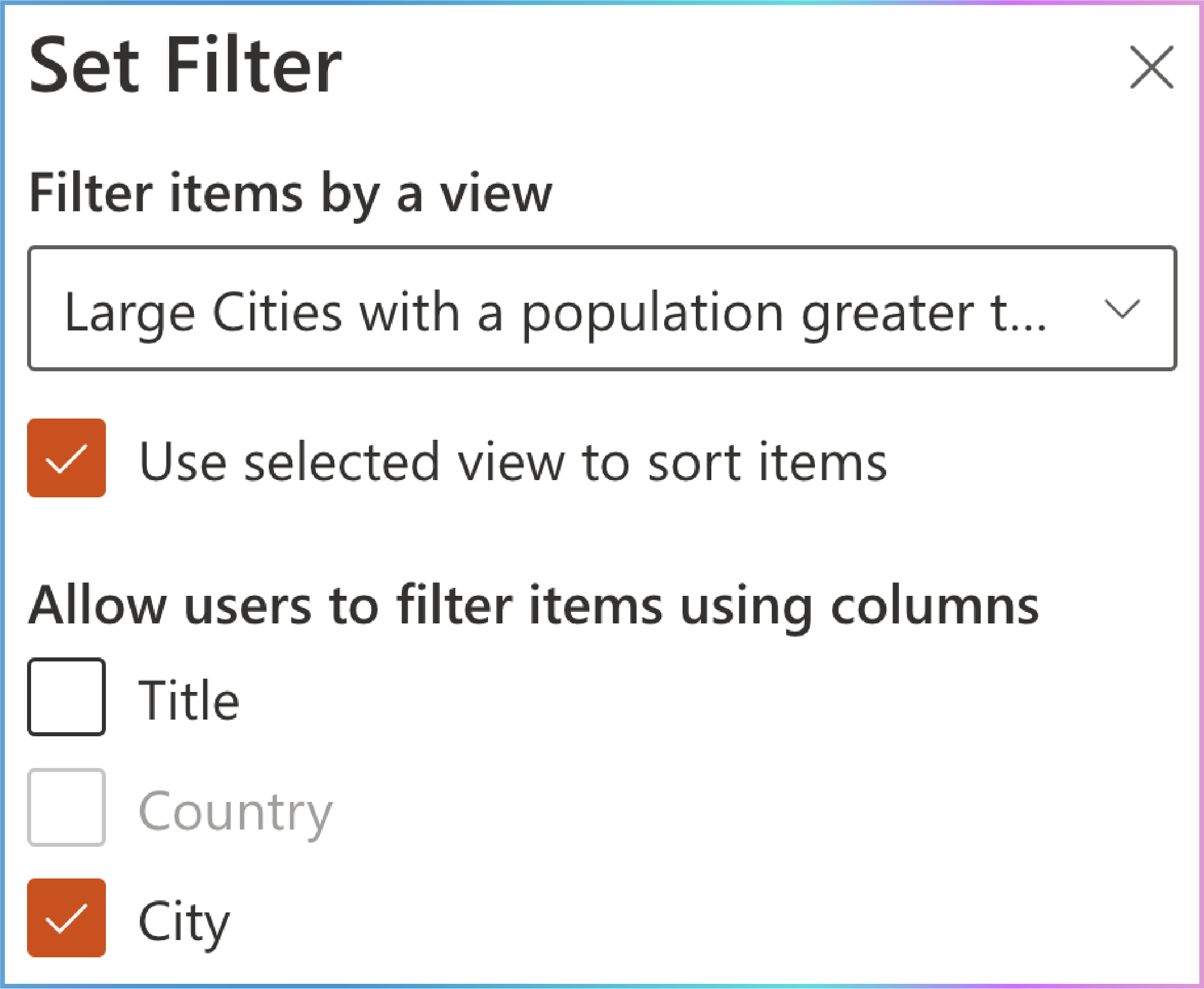
On the New or Edit cascaded item forms , choose the contains operator and type New.

Result:
The City dropdown in the Employee List will display cities that:
Belong to the "Large Cities with a population greater than 3,000,000 (Descending)" view.
Have a City that contains New.
The resulting filtered city is:
Visual Example:
| Employee Name | Country (Parent) | City (Child) |
|---|---|---|
| John Doe | USA | New York |
Key Takeaway
By following this step-by-step process, you can effectively combine view-based filtering, sorting, and column-based filtering to refine the data in the cascaded lookup column. Here’s how it works:
Filter Items by a View:
Applies a broad filter (e.g., population > 3,000,000) to narrow down the options.
Ensures only relevant items are displayed in the cascaded lookup column.
Use Selected View to Sort Items:
Applies the sorting order defined in the selected view (e.g., descending by population).
Ensures the items are displayed in a logical and user-friendly order.
Allow Users to Filter Items Using Columns:
Further refines the options based on specific criteria (e.g., City contains "New").
Ensures the user can find exactly what they’re looking for within the already filtered and sorted view.
Why This Works Better
Logical Progression: The user first applies a broad filter (view), then sorts the results, and finally refines it further (column filter). This ensures a smooth and intuitive user experience.
Improved User Experience: The cascading filters work together seamlessly, reducing confusion and ensuring accurate results.
Flexibility: Users can start with a broad filter, sort the results, and narrow it down as needed, making the system more intuitive and user-friendly.

8. Show related columns on New/Edit Cascaded Item form
Location: Directly below the Filter option.
Purpose: When creating a new cascaded item or editing an existing one, the New/Edit Cascaded Item forms can display related columns from the source list alongside the cascaded lookup column options in a single dropdown menu. This provides additional context and a more comprehensive understanding of the data while managing cascaded lookup items.
Limitation: The related columns are only visible on the New/Edit cascaded item forms and cannot be displayed on the Item View form .
Why This Matters
When managing cascaded lookup items, seeing only the cascaded lookup column (e.g., City) might not provide enough context. By showing related columns (e.g., Country and Zip Code ) alongside the cascaded lookup column options in a single dropdown menu, users can better understand the data they are working with. This feature enhances usability and reduces errors by providing a complete picture of the data during item creation or editing.
How It Works
Dropdown Menu:
The Show related columns on New/Edit Cascaded Item form option is a dropdown menu.
It allows you to select related columns from the source list to display alongside the cascaded lookup column options in a single dropdown menu.
Combined Display:
The selected related columns are displayed alongside the cascaded lookup column options in a single dropdown menu on the New/Edit cascaded item forms.
This means users can view the related data (e.g., Country and Zip Code ) together with the cascaded lookup column options (e.g., City) in a structured and easy-to-read format while creating or editing an item.
Example Scenario:
If the cascaded lookup column is City, you might want to show:
Country: To indicate which country the city belongs to.
Zip Code: To provide additional location details.
Result:
When creating or editing a cascaded item, the form will display:
The cascaded lookup column (e.g., City).
The selected related columns (e.g., Country and Zip Code ) alongside the cascaded lookup column options in a single dropdown menu.
Example Scenario
Source List (City List):
| City | Country (Filter by Column) (Related Column) | Zip Code (Related Column) |
|---|---|---|
| New York | USA | 10001 |
| Los Angeles | USA | 90001 |
| Toronto | Canada | M5V 3L9 |
| Vancouver | Canada | V6B 1A1 |
Current List (Employee List):
| Employee Name | Country (Parent) | City (Cascaded Lookup Column) |
|---|---|---|
| John Doe | USA | New York |
| Jane Smith | Canada | Toronto |
Step-by-Step Setup
Click "Show related columns on New/Edit Cascaded Item form":
Open the dropdown menu in the Show related columns on New/Edit Cascaded Item form option.
Select Related Columns:
Choose the columns you want to display alongside the cascaded lookup column options in the single dropdown menu .
For example, select Country and Zip Code .
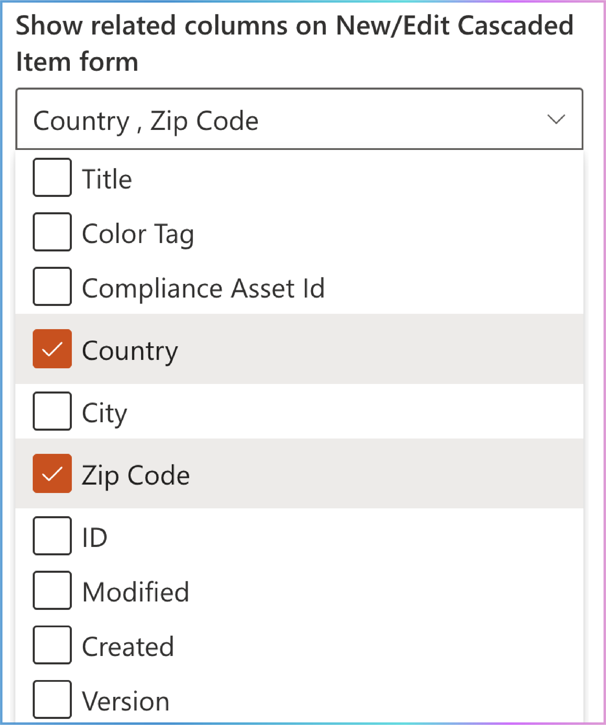
Result:
When creating or editing a cascaded item, the form will display:
The cascaded lookup column (e.g., City).
The selected related columns (e.g., Country and Zip Code ) alongside the cascaded lookup column options in a single dropdown menu.
Visual Example
New/Edit Cascaded Item Form:
| Field | Dropdown Menu (Cascaded Lookup Column with Related Columns) |
|---|---|
| City | [New York, USA, 10001] |
| [Los Angeles, USA, 90001] | |
| [Toronto, Canada, M5V 3L9] | |
| [Vancouver, Canada, V6B 1A1] |
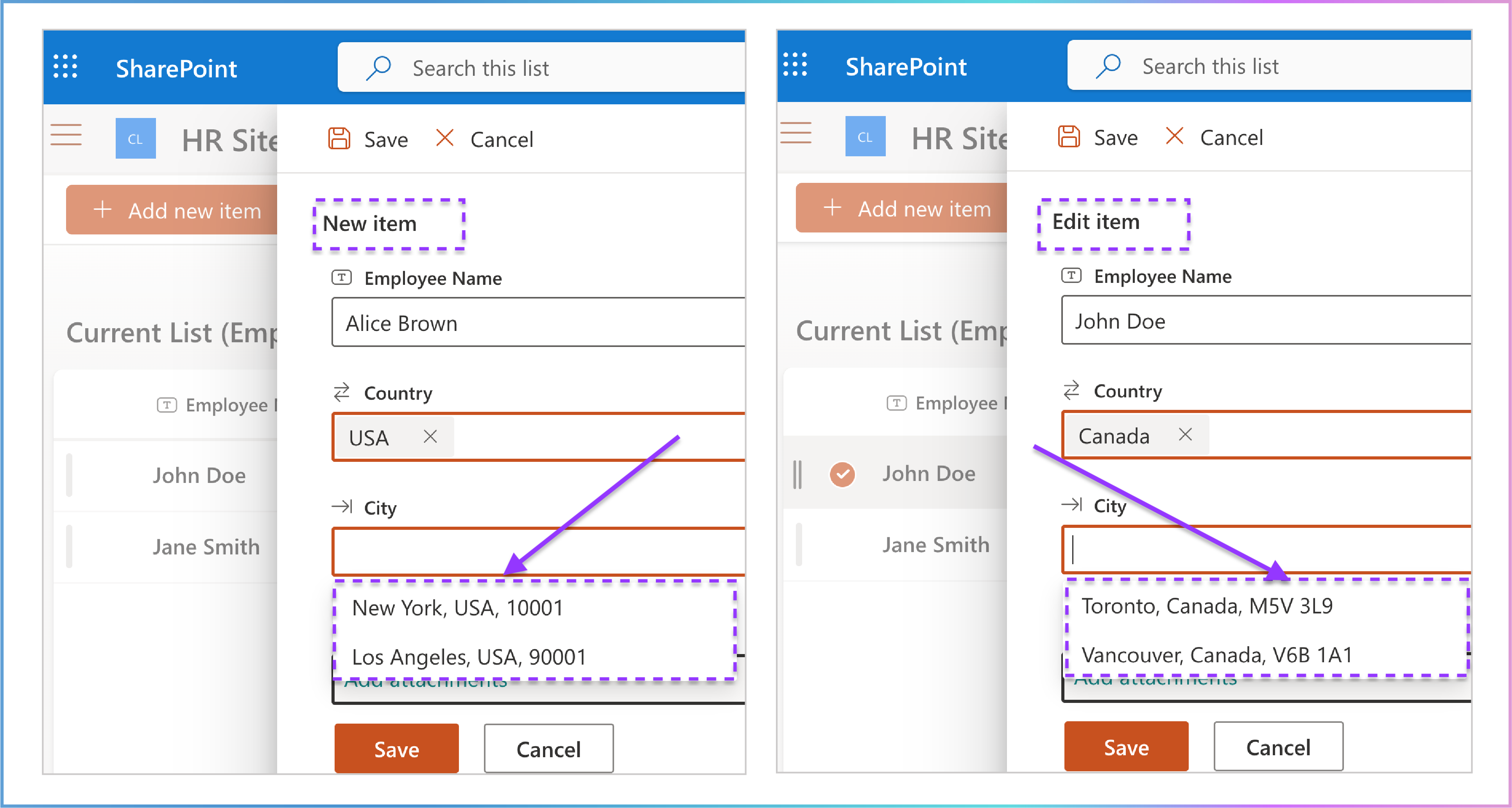
Key Takeaway
The Show related columns on New/Edit Cascaded Item form option allows you to display additional columns from the source list alongside the cascaded lookup column options in a single dropdown menu on the New/Edit Cascaded Item forms. This provides more context and a better understanding of the data while managing cascaded lookup items. However, these related columns are only visible on the New/Edit forms and cannot be displayed on the Item View form .
Why This Works Better
Enhanced Context: By showing related columns (e.g., Country and Zip Code ) alongside the cascaded lookup column options in a single dropdown menu, users can better understand the data they are working with during item creation or editing.
Improved Usability: Reduces errors and confusion by providing a complete picture of the data in a structured format.
Flexibility: Allows users to customize the form to display the most relevant information for their needs.
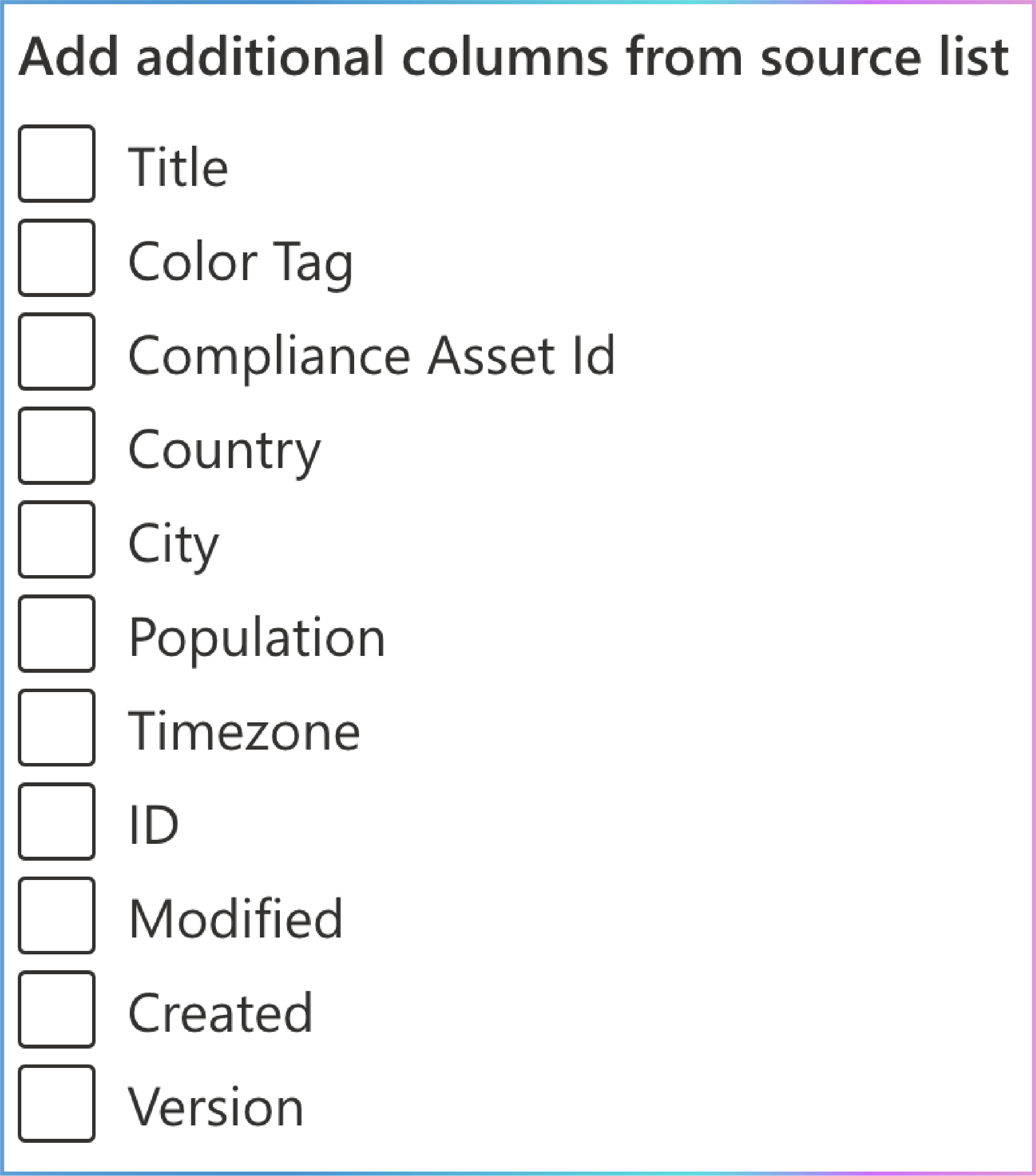
9. Add Additional Columns from Source List
Location: Directly below the Show related columns on New/Edit Cascaded Item form option.
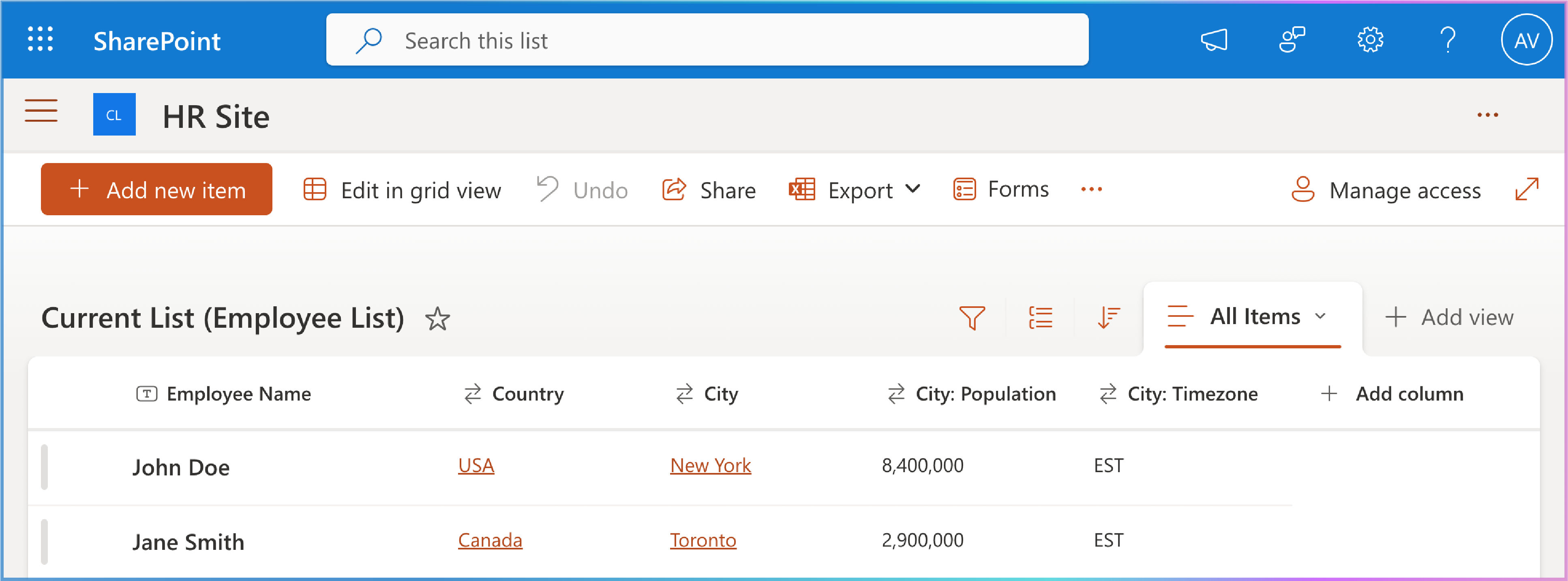
Purpose: Allows you to include additional columns from the source list as read-only fields that only appear on the list view page . These columns provide extra context or details about the selected cascaded lookup item but cannot be edited by users.
Usage: This feature is useful when you want to display more information about the selected item in the list view without allowing users to modify it.
How It Works
Select Additional Columns:
Use the checkbox to choose additional columns from the source list.
For example, if the cascaded lookup column is City, you might add Population and Timezone as additional columns.
Display on List View Page:
The selected additional columns will appear as read-only fields only on the list view page.
These fields are automatically populated based on the selected cascaded lookup item.
Example Scenario:
If the cascaded lookup column is City, and you add Population and Timezone as additional columns, the list view page will display:
City: [Selected city, e.g., New York]
Population: [Read-only field, e.g., 8,400,000]
Timezone: [Read-only field, e.g., EST]
Example Scenario
Source List (City List):
| City | Country (Filter by Column) | Population | Timezone |
|---|---|---|---|
| New York | USA | 8,400,000 | EST |
| Los Angeles | USA | 3,900,000 | PST |
| Toronto | Canada | 2,900,000 | EST |
| Vancouver | Canada | 2,500,000 | PST |
Current List (Employee List):
| Employee Name | Country (Parent) | City (Cascaded Lookup Column) | Population (Additional Column) | Timezone (Additional Column) |
|---|---|---|---|---|
| John Doe | USA | New York | 8,400,000 | EST |
| Jane Smith | Canada | Toronto | 2,900,000 | EST |
Step-by-Step Setup
Check the Column List:
In the Add additional columns from source list option, view the list of available columns from the source list.
Choose Additional Columns:
Select the columns you want to display as read-only fields on the list view page by checking the checkbox before each column.
For example, check the boxes for Population and Timezone.
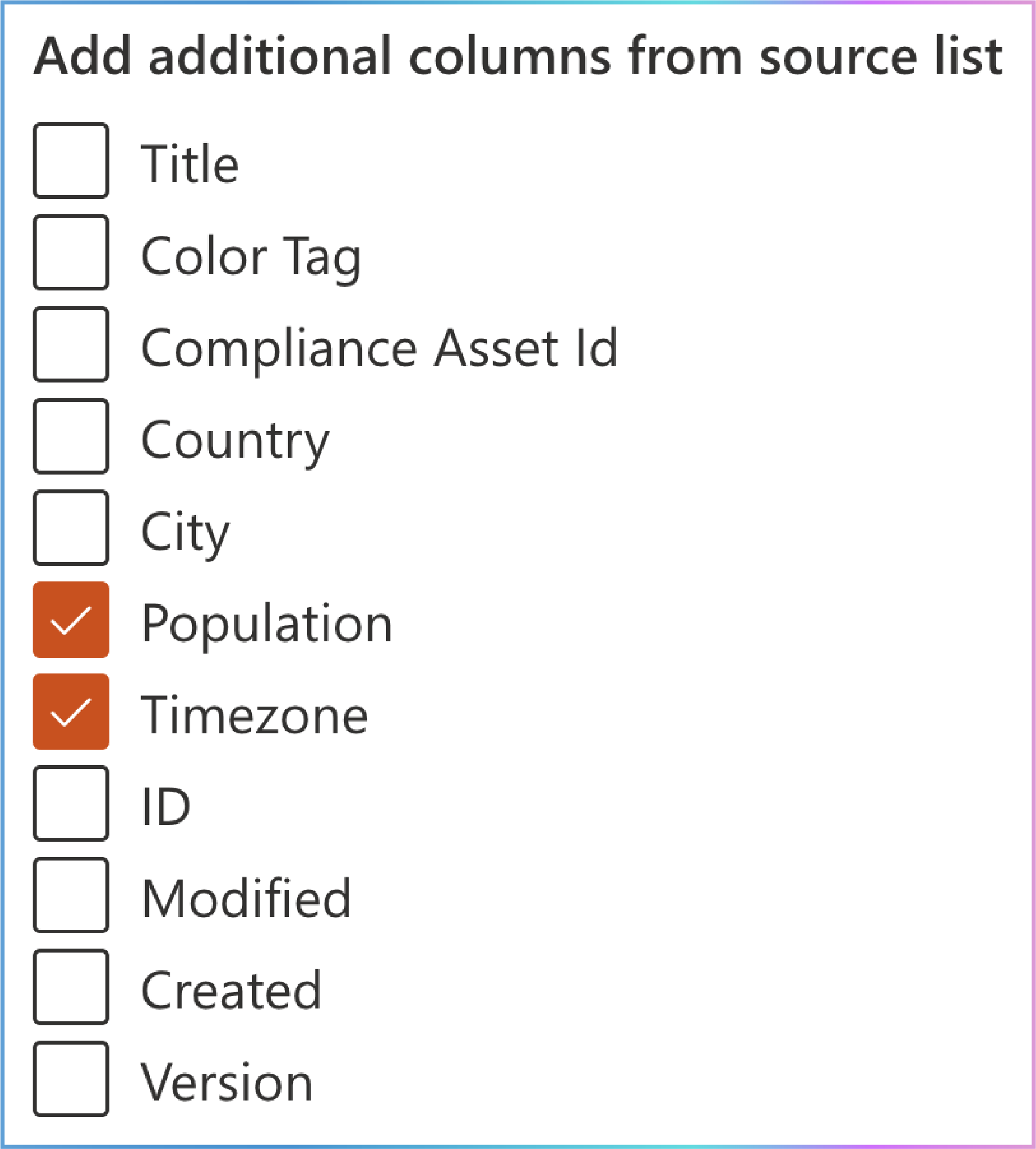
Result on List View Page:
The list view page will display:
The cascaded lookup column (e.g., City).
The selected additional columns (e.g., Population and Timezone) as read-only fields.
Visual Example
List View Page:
| Employee Name | Country (Parent) | City (Cascaded Lookup Column) | Population (Additional Column) | Timezone (Additional Column) |
|---|---|---|---|---|
| John Doe | USA | New York | 8,400,000 | EST |
| Jane Smith | Canada | Toronto | 2,900,000 | EST |
Key Benefits
Enhanced Context: Displays additional details (e.g., Population and Timezone) about the selected cascaded lookup item, providing a more comprehensive understanding of the data.
Improved Usability: Helps users quickly access relevant information without allowing edits.
Streamlined Experience: Keeps the list view page informative and focused by displaying only the most relevant details.
Why This Matters
This feature ensures that users have access to additional context about the selected cascaded lookup item directly on the list view page, enhancing data visibility and user efficiency without cluttering the form or allowing unintended modifications.
10. Deletions from Source List Affect This List
Location: Directly below the Add additional columns from source list option.
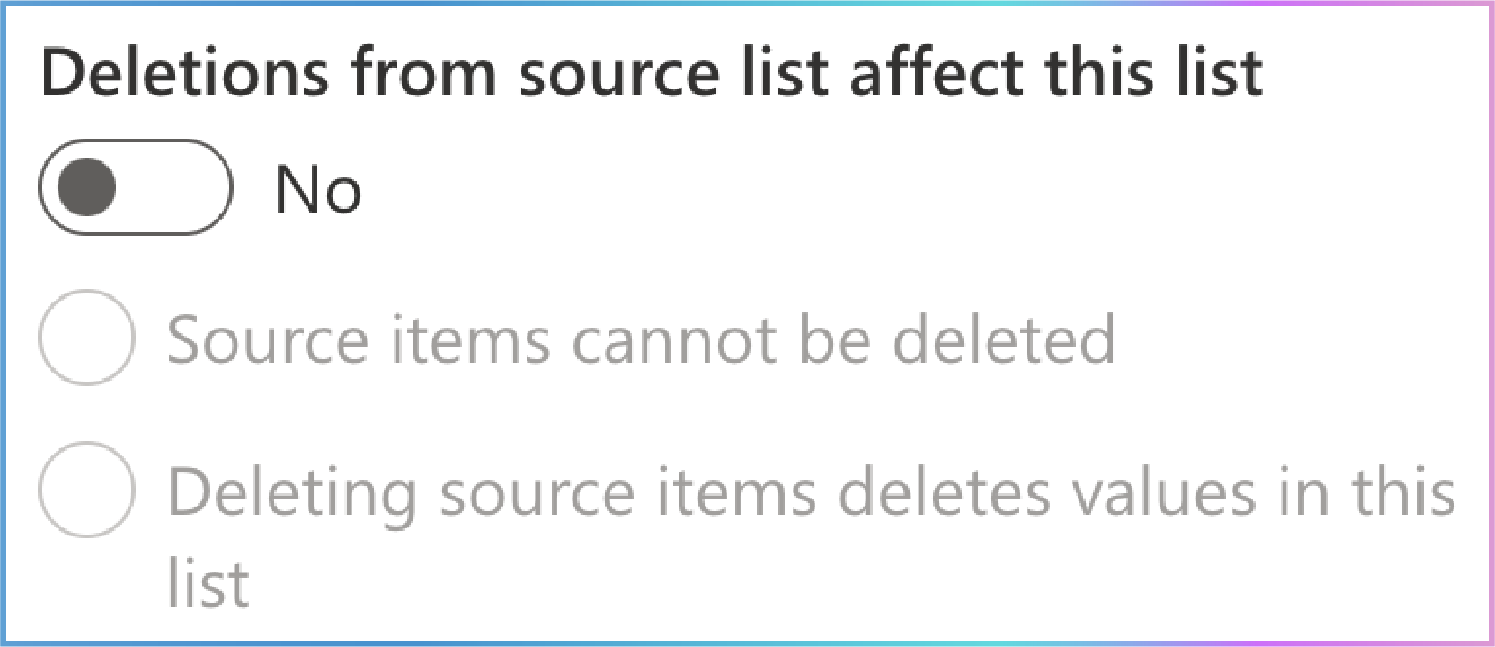
Purpose: Determines how deletions in the source list impact the cascaded lookup column in the current list. This setting ensures data consistency and helps manage dependencies between the source list and the current list.
Switch Button: This feature is controlled by a switch button that you can toggle on or off.
Options:
Disabled: Deletions from the source list do not affect the current list.
Enabled: Choose between two options:
Source items cannot be deleted: Prevents items in the source list from being deleted if they are referenced in the current list.
Deleting source items deletes values in this list: Automatically removes or updates the corresponding entries in the current list when an item is deleted from the source list.
How It Works
Disabled:
Deletions in the source list do not affect the current list.
This means that if an item is deleted from the source list, the corresponding entries in the current list remain unchanged, potentially leading to orphaned references.
Enabled:
Source items cannot be deleted:
If an item in the source list is referenced in the current list, it cannot be deleted from the source list.
This ensures that no orphaned references exist in the current list, maintaining data integrity.
Deleting source items deletes values in this list:
If an item in the source list is deleted, the corresponding entries in the current list are automatically removed or updated .
This ensures that the current list remains consistent with the source list.
Example Scenario
Source List (City List):
| City | Country (Filter by Column) |
|---|---|
| New York | USA |
| Los Angeles | USA |
| Toronto | Canada |
| Vancouver | Canada |
Current List (Employee List):
| Employee Name | Country (Parent) | City (Cascaded Lookup Column) |
|---|---|---|
| John Doe | USA | New York |
| Jane Smith | Canada | Toronto |
Step-by-Step Setup
Toggle the Switch:
In the Deletions from source list affect this list option, toggle the switch to enable or disable the feature.
If Enabled, Choose an Option:
Source items cannot be deleted:
If New York is referenced in the Employee List , it cannot be deleted from the City List.
Deleting source items deletes values in this list:
Visual Example
Before Deletion:
| Employee Name | Country (Parent) | City (Cascaded Lookup Column) |
|---|---|---|
| John Doe | USA | New York |
| Jane Smith | Canada | Toronto |
After Cascade Deletion of Toronto:
| Employee Name | Country (Parent) | City (Cascaded Lookup Column) |
|---|---|---|
| John Doe | USA | New York |
Key Benefits
Data Integrity: Ensures that deletions in the source list do not leave orphaned references in the current list.
Consistency: Maintains consistency between the source list and the current list by automatically updating or removing entries.
Flexibility: Provides options to either restrict deletions or cascade them, depending on your data management needs.
Why This Matters
This feature ensures that your data remains consistent and accurate, even when items are deleted from the source list. By choosing the appropriate deletion behavior, you can prevent data inconsistencies and maintain the integrity of your lists.

11. Remove Duplicate Items from the Dropdown List
Location: Directly below the Deletions from source list affect this list option.
Purpose: Ensures that the dropdown list in the cascaded lookup column does not display duplicate items. This feature helps streamline the user experience by presenting a clean and concise list of options.
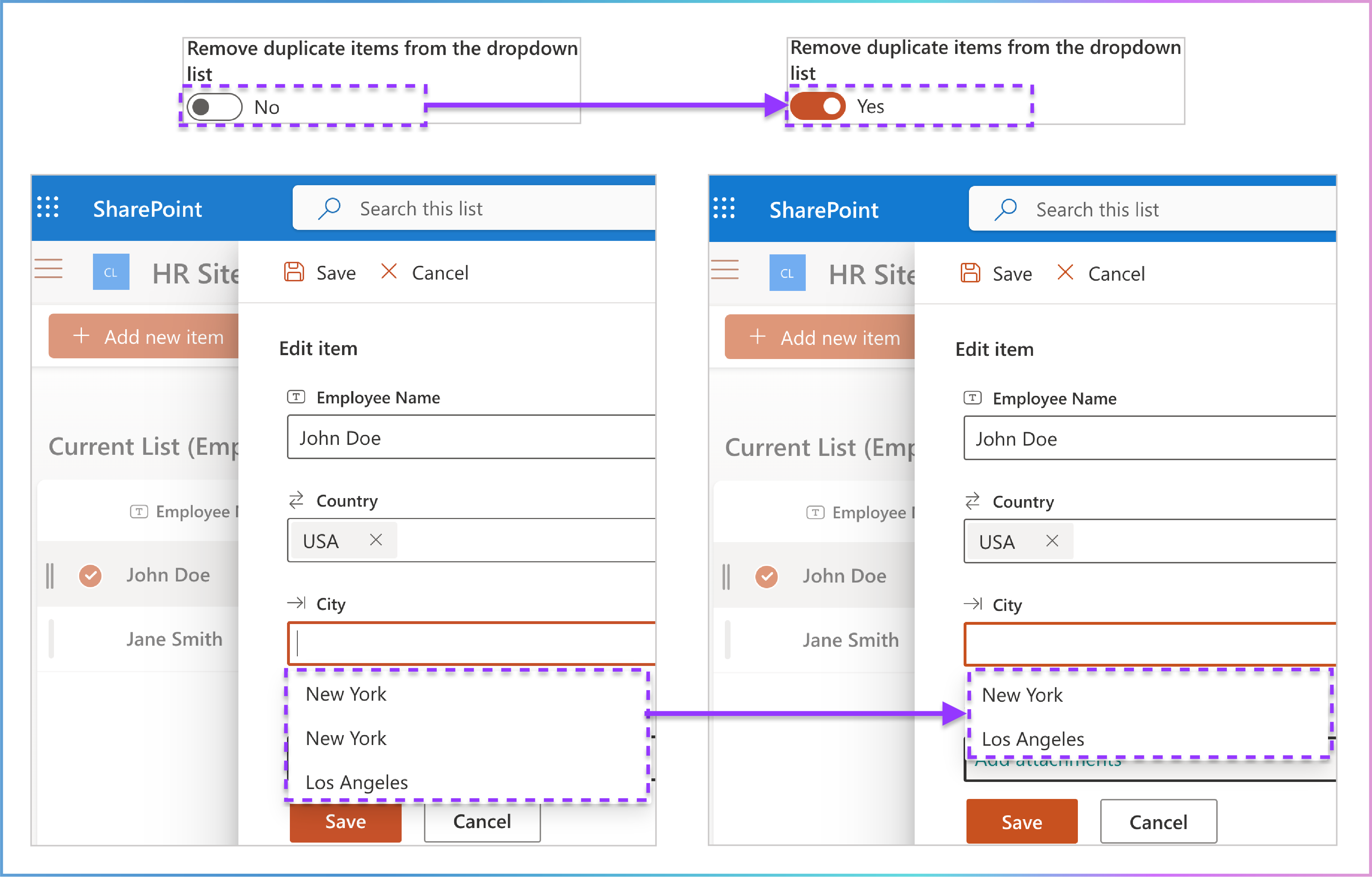
Behavior: When enabled, the dropdown list will automatically remove any duplicate entries, ensuring that each option appears only once.
Switch Button: This feature is controlled by a switch button that you can toggle on or off.
How It Works
Toggle the Switch:
Use the switch button to enable or disable the Remove duplicate items from the dropdown list feature.
When enabled, the dropdown list will filter out duplicate items.
When disabled, the dropdown list will display all entries, including duplicates.
User Experience:
In the New/Edit cascaded item forms, the cascaded lookup column will display a clean dropdown list without duplicate entries when the feature is enabled.
Users will only see unique options, making it easier to select the correct value.
Example Scenario:
Example Scenario
Source List (City List):
| City | Country (Filter by Column) | Timezone Offset | Timezone |
|---|---|---|---|
| New York | USA | UTC-5 | EST |
| New York | USA | UTC-4 | EDT |
| Los Angeles | USA | UTC-8 | PST |
| Toronto | Canada | UTC-5 | EST |
| Vancouver | Canada | UTC-8 | PST |
Current List (Employee List):
| Employee Name | Country (Parent) | City (Cascaded Lookup Column) |
|---|---|---|
| John Doe | USA | New York |
| Jane Smith | Canada | Toronto |
Step-by-Step Setup
Toggle the Switch:
In the Remove duplicate items from the dropdown list option, toggle the switch button to enable or disable the feature.
Result on New/Edit Forms:
When enabled, the dropdown list will display unique options (e.g., New York will only appear once).
When disabled, the dropdown list will display all entries, including duplicates.
Visual Example
Before Removing Duplicates:
| Field | Value |
|---|---|
| City | [Dropdown menu] |
| - New York | |
| - New York | |
| - Los Angeles | |
| - Toronto | |
| - Vancouver |
After Removing Duplicates:
| Field | Value |
|---|---|
| City | [Dropdown menu] |
| - New York | |
| - Los Angeles | |
| - Toronto | |
| - Vancouver |
Key Benefits
Cleaner Interface: Removes duplicate entries from the dropdown list, providing a more streamlined and user-friendly experience.
Improved Usability: Helps users quickly find and select the correct option without confusion caused by duplicates.
Data Consistency: Ensures that the dropdown list accurately reflects the unique options available in the source list.
Why This Matters
This feature is particularly useful when the source list contains duplicate entries, which can clutter the dropdown list and make it difficult for users to find the correct option. By enabling Remove duplicate items from the dropdown list, you can ensure a cleaner and more efficient user experience.

12. Allow Multiple Selections
Location: Directly below the Remove duplicate items from the dropdown list option.
Purpose: Enables users to select multiple values from the cascaded lookup column, similar to how SharePoint’s native lookup column allows multiple selections.
Behavior: When enabled, the cascaded lookup column behaves like a multi-select dropdown, allowing users to choose more than one option from the available list.
Switch Button: This feature is controlled by a switch button that you can toggle on or off.
How It Works
Toggle the Switch:
Use the switch button to enable or disable the Allow multiple selections feature.
When enabled, the cascaded lookup column will allow users to select multiple values.
When disabled, users can only select a single value.
User Experience:
In the New/Edit cascaded item forms, the cascaded lookup column will display as a multi-select dropdown when the feature is enabled.
Users can select multiple options by clicking to choose from the dropdown options in the cascaded lookup column. Each selected option is added to the list, allowing users to pick multiple values seamlessly.
Data Storage:
The selected values are stored as a space-separated list in the cascaded lookup column.
For example, if a user selects New York and Los Angeles, the column will store: New York Los Angeles.
Example Scenario
Source List (City List):
| City | Country (Filter by Column) |
|---|---|
| New York | USA |
| Los Angeles | USA |
| Toronto | Canada |
| Vancouver | Canada |
Current List (Employee List):
| Employee Name | Country (Parent) | City (Cascaded Lookup Column) |
|---|---|---|
| John Doe | USA | New York, Los Angeles |
| Jane Smith | Canada | Toronto, Vancouver |
Step-by-Step Setup
Toggle the Switch:
In the Allow multiple selections option, toggle the switch button to enable or disable the feature.
Result on New/Edit cascaded item Forms:
When enabled, the cascaded lookup column will display as a multi-select dropdown.
Users can select multiple options (e.g., New York and Los Angeles).
Data Storage:
Visual Example
New/Edit Cascaded Item Form:
| Field | Value |
|---|---|
| City | [Multi-select dropdown] |
| - New York | |
| - Los Angeles |
List View Page:
| Employee Name | Country (Parent) | City (Cascaded Lookup Column) |
|---|---|---|
| John Doe | USA | New York, Los Angeles |
| Jane Smith | Canada | Toronto, Vancouver |
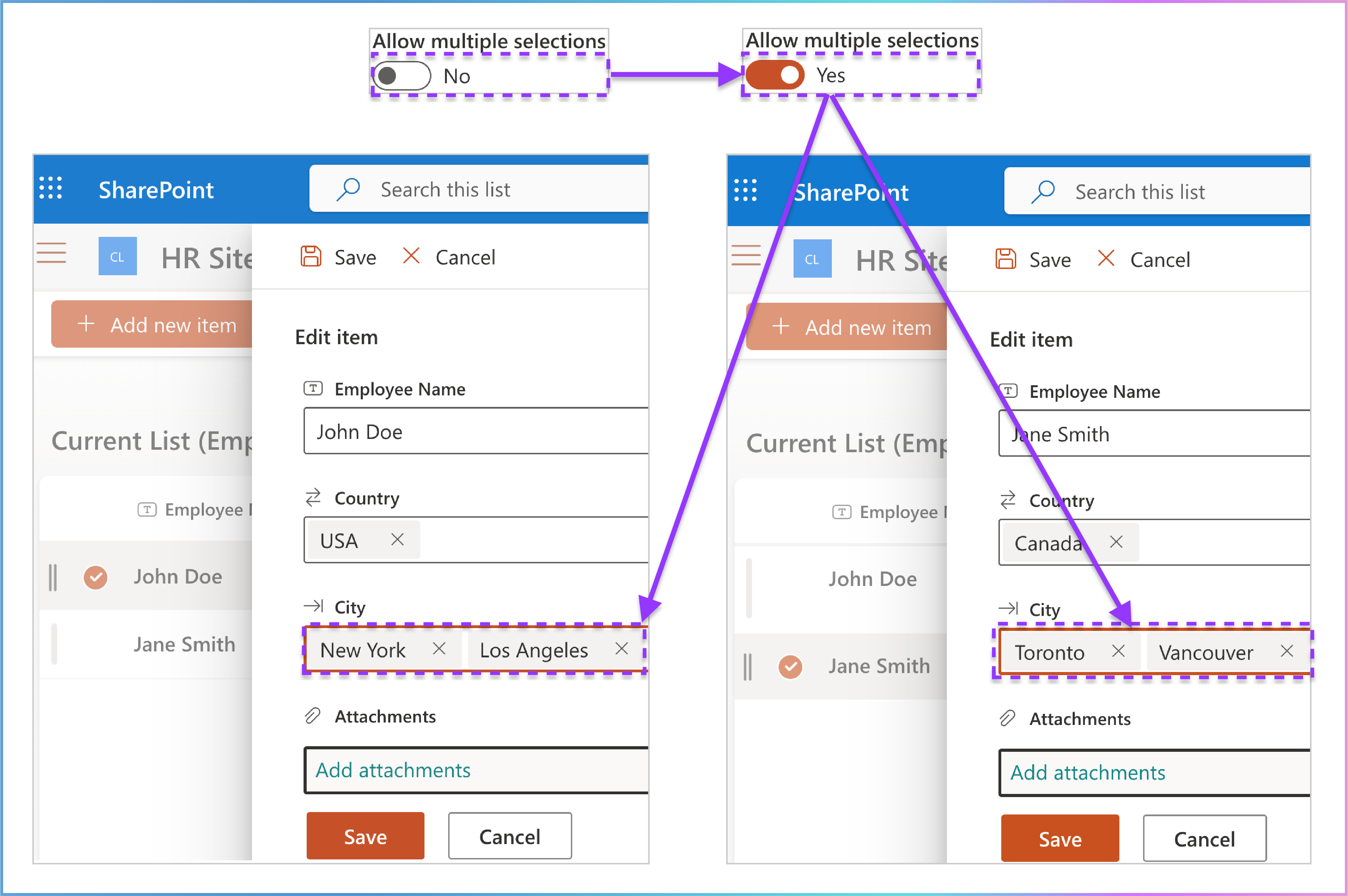
Key Benefits
Flexibility: Allows users to select multiple values from the cascaded lookup column, providing more flexibility in data entry.
Improved Usability: Enhances the user experience by making it easier to select multiple options in a single field.
Data Consistency: Ensures that all selected values are stored and displayed correctly in the list.
Why This Matters
This feature is particularly useful when you need to associate multiple values with a single item. For example, an employee might work in multiple cities, or a project might involve multiple locations. By enabling Allow multiple selections, you can capture this information efficiently and accurately.
Interaction Between “Allow Multiple Selections” and Other Options
When “Allow Multiple Selections” is Enabled:
The Deletions from Source List Affect This List and Enforce unique valuesoptions will turn grey and become non-editable.
These options will freeze in their default state (disabled) and cannot be changed while multiple selections are allowed.
Why This Happens:
Deletions from Source List Affect This List: Managing deletions for multiple selections is complex, so this option is disabled to avoid data inconsistencies.
Enforce Unique Values: Enforcing uniqueness is not applicable when multiple selections are allowed, as the column inherently supports duplicate values within a single entry (e.g., selecting the same city multiple times).
User Experience:
Users will see these options greyed out and cannot toggle them while Allow Multiple Selections is enabled.
To edit these options, users must first disable Allow Multiple Selections .
This behavior ensures that the system maintains data integrity and avoids conflicts when multiple selections are enabled.

Location: Directly below the Allow multiple selections option.
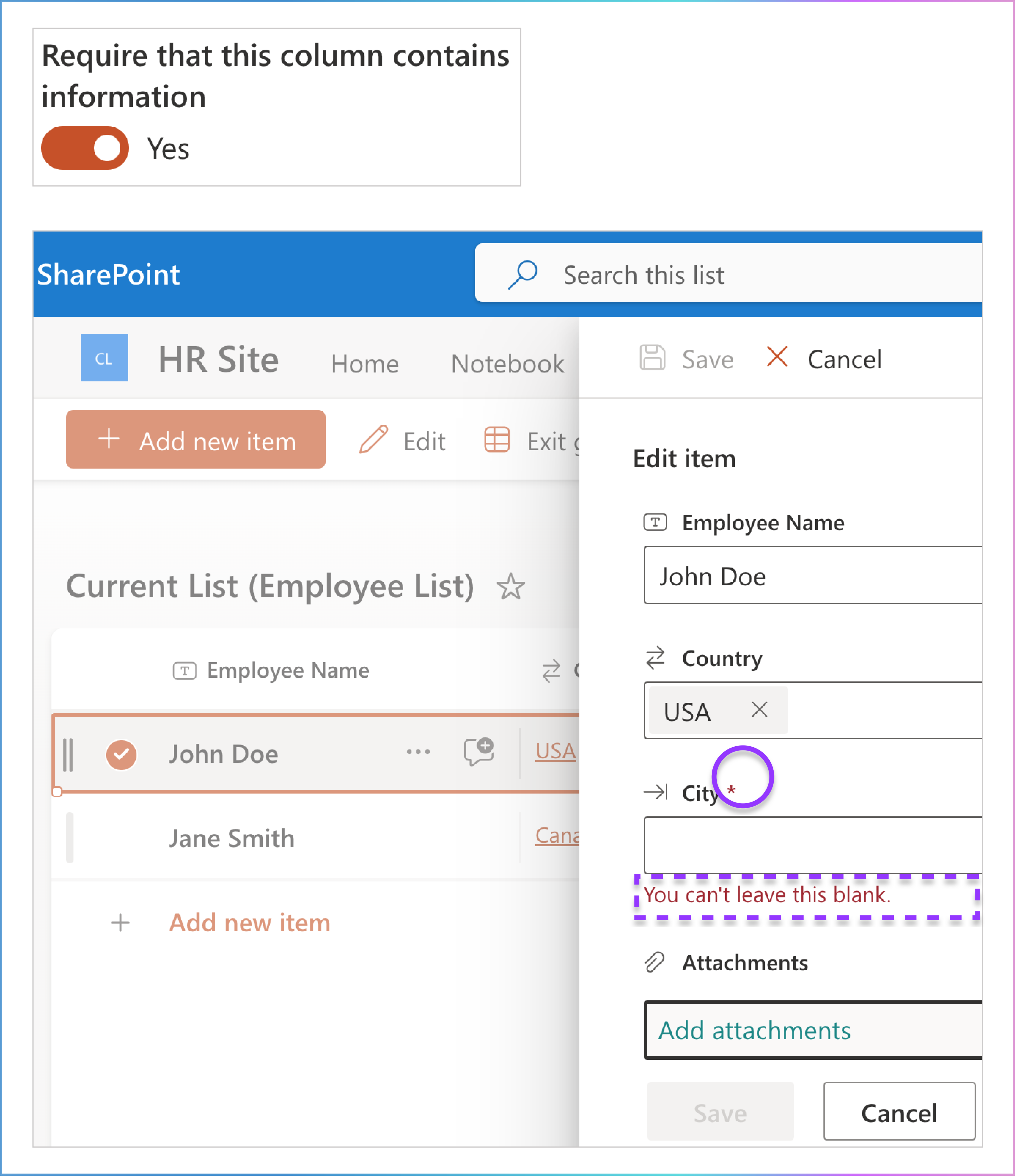
Purpose: Ensures that the cascaded lookup column must contain a value when creating or editing an item in the list. This feature helps maintain data integrity by preventing users from leaving the column empty.
Behavior: When enabled, users are required to select a value from the cascaded lookup column before they can save the item.
Switch Button: This feature is controlled by a switch button that you can toggle on or off.
How It Works
Toggle the Switch:
Use the switch button to enable or disable the Require that this column contains information feature.
When enabled, the cascaded lookup column becomes a required field, and users must select a value before saving the item.
When disabled, the cascaded lookup column is optional, and users can leave it empty.
User Experience:
In the New/Edit cascaded lookup forms, the cascaded lookup column will display a required field indicator (e.g., a red asterisk) when the feature is enabled.
Users will be prompted to select a value if they try to save the item without filling in the required field.
Example Scenario:
Example Scenario
Source List (City List):
| City | Country (Filter by Column) |
|---|---|
| New York | USA |
| Los Angeles | USA |
| Toronto | Canada |
| Vancouver | Canada |
Current List (Employee List):
| Employee Name | Country (Parent) | City (Cascaded Lookup Column) |
|---|---|---|
| John Doe | USA | New York |
| Jane Smith | Canada | Toronto |
Step-by-Step Setup
Toggle the Switch:
In the Require that this column contains information option, toggle the switch button to enable or disable the feature.
Result on New/Edit Cascaded Item Forms:
When enabled, the cascaded lookup column becomes a required field, and users must select a value before saving the item.
When disabled, the cascaded lookup column is optional, and users can leave it empty.
Visual Example
New/Edit Cascaded Item Form:
| Field | Value |
|---|---|
| Employee Name | John Doe |
| City | [Dropdown menu] Required |
| - New York | |
| - Los Angeles |
Key Benefits
Data Integrity: Ensures that the cascaded lookup column always contains a value, preventing incomplete or inaccurate data entries.
Improved Usability: Provides clear guidance to users by indicating required fields and prompting them to fill in necessary information.
Consistency: Maintains consistency across the list by ensuring that all items have the required information.
Why This Matters
This feature is particularly useful when the cascaded lookup column contains critical information that must be provided for each item. By enabling Require that this column contains information, you can ensure that your data remains complete and accurate.
14. Enforce Unique Values
Location: Directly below the Require that this column contains information option.
Purpose: Ensures that the values in the cascaded lookup column are unique across the list. This feature prevents duplicate entries in the column, maintaining data integrity and consistency.
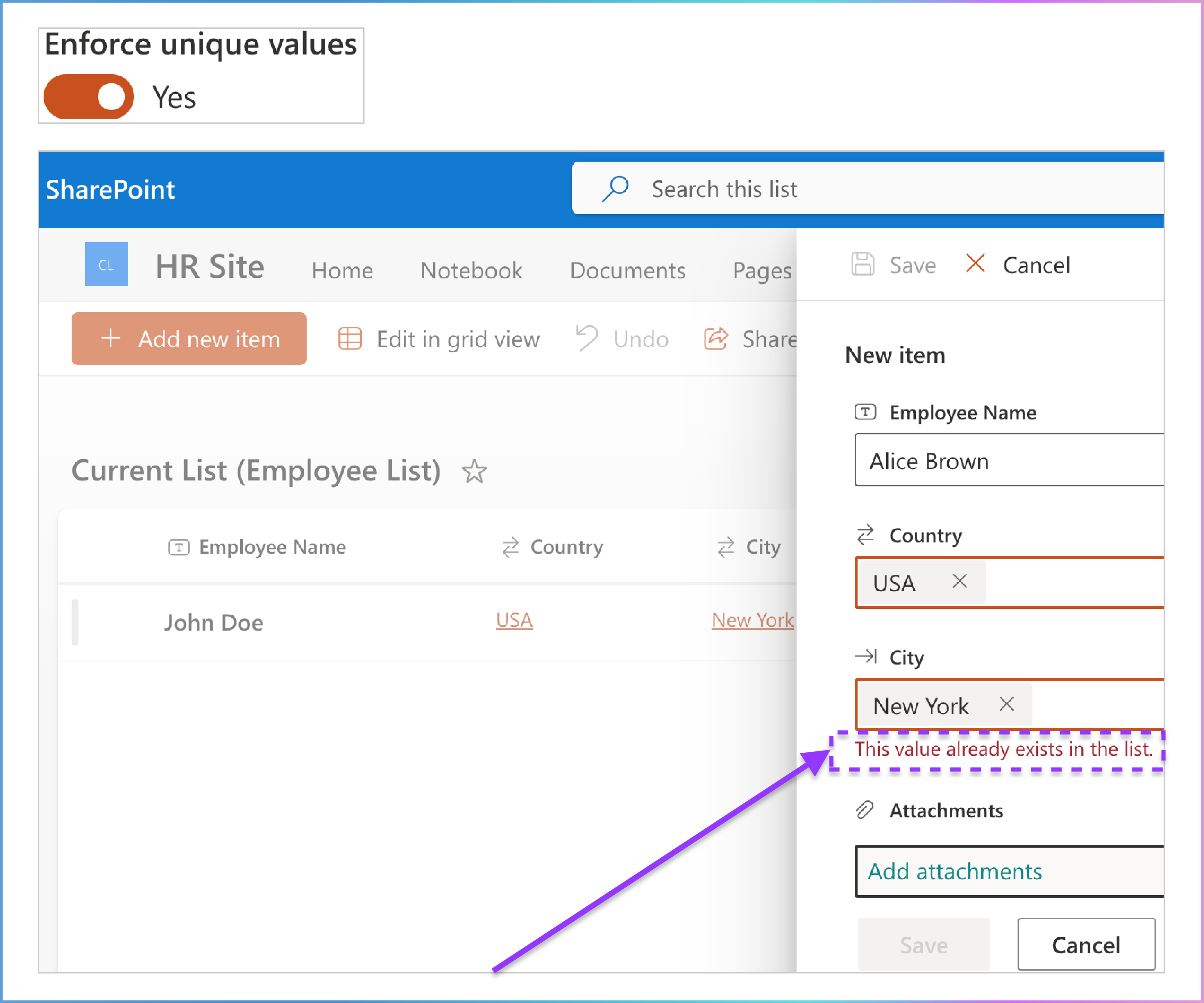
Behavior: When enabled, users cannot enter or select a value that already exists in the cascaded lookup column.
Switch Button: This feature is controlled by a switch button that you can toggle on or off.
How It Works
Toggle the Switch:
Use the switch button to enable or disable the Enforce unique values feature.
When enabled, the cascaded lookup column will enforce uniqueness, preventing duplicate entries.
When disabled, duplicate values are allowed in the column.
User Experience:
In the New/Edit cascaded item forms, if a user tries to enter or select a value that already exists in the cascaded lookup column, they will receive an error message .
Users must provide a unique value before they can save the item.
Example Scenario:
Example Scenario
Source List (City List):
| City | Country (Filter by Column) |
|---|---|
| New York | USA |
| Los Angeles | USA |
| Toronto | Canada |
| Vancouver | Canada |
Current List (Employee List):
| Employee Name | Country (Parent) | City (Cascaded Lookup Column) |
|---|---|---|
| John Doe | USA | New York |
Step-by-Step Setup
Toggle the Switch:
In the Enforce unique values option, toggle the switch button to enable or disable the feature.
Result on New/Edit Cascaded Item Forms:
When enabled, users cannot enter or select a value that already exists in the cascaded lookup column.
When disabled, duplicate values are allowed in the column.
Visual Example
New/Edit Cascaded Item Form:
| Field | Value |
|---|---|
| Employee Name | Alice Brown |
| City | [Dropdown menu] |
| - New York | |
| - Los Angeles |
Error Message:
Key Benefits
Data Integrity: Ensures that the cascaded lookup column contains only unique values, preventing duplicate entries.
Improved Usability: Provides clear feedback to users when they attempt to enter a duplicate value, helping them correct their input.
Consistency: Maintains consistency across the list by ensuring that each value in the cascaded lookup column is unique.
Why This Matters
This feature is particularly useful when the cascaded lookup column contains critical information that must be unique for each item. By enabling Enforce unique values, you can ensure that your data remains accurate and consistent.

15. Add to All Content Types
Location: Directly below the Enforce unique values option.
Purpose: Ensures that the cascaded lookup column is added to all content types associated with the list. This feature allows the column to be available across different content types, ensuring consistency and accessibility.
Behavior: When enabled, the cascaded lookup column is automatically added to all content types in the list. When disabled, the column is only added to the default content type.
Switch Button: This feature is controlled by a switch button that you can toggle on or off.
How It Works
Toggle the Switch:
Use the switch button to enable or disable the Add to all content types feature.
When enabled, the cascaded lookup column is added to all content types in the list.
When disabled, the column is only added to the default content type.
User Experience:
In the New/Edit cascaded item forms, the cascaded lookup column will be available across all content types when the feature is enabled.
Users can access and use the column regardless of the content type they are working with.
Example Scenario:
If the list has multiple content types (e.g., Employee, Contractor), and the feature is enabled, the cascaded lookup column will be available in both content types.
Example Scenario
Content Types in the List:
Employee
Contractor
Source List (City List):
| City | Country (Filter by Column) |
|---|---|
| New York | USA |
| Los Angeles | USA |
| Toronto | Canada |
| Vancouver | Canada |
Current List (Employee List):
| Employee Name | Country (Parent) | City (Cascaded Lookup Column) |
|---|---|---|
| John Doe | USA | New York |
| Jane Smith | Canada | Toronto |
Step-by-Step Setup
Toggle the Switch:
In the Add to all content types option, toggle the switch button to enable or disable the feature.
Result on New/Edit Cascaded Lookup Forms:
When enabled, the cascaded lookup column is added to all content types in the list.
When disabled, the column is only added to the default content type .
Visual Example
New/Edit Cascaded Item Form:
| Field | Value |
|---|---|
| Employee Name | John Doe |
| City | [Dropdown menu] |
| - New York | |
| - Los Angeles |
Key Benefits
Consistency: Ensures that the cascaded lookup column is available across all content types, maintaining consistency in data entry and management.
Improved Usability: Provides users with access to the column regardless of the content type they are working with, enhancing the overall user experience.
Flexibility: Allows administrators to control whether the column should be available in all content types or just the default content type.
Why This Matters
This feature is particularly useful when working with lists that have multiple content types. By enabling Add to all content types , you can ensure that the cascaded lookup column is accessible and consistent across all content types, making it easier for users to manage and interact with the data.
